MoMA
Bringing an iconic new brand into the digital world
Deliverables
User Interface
Website design
Creative Direction
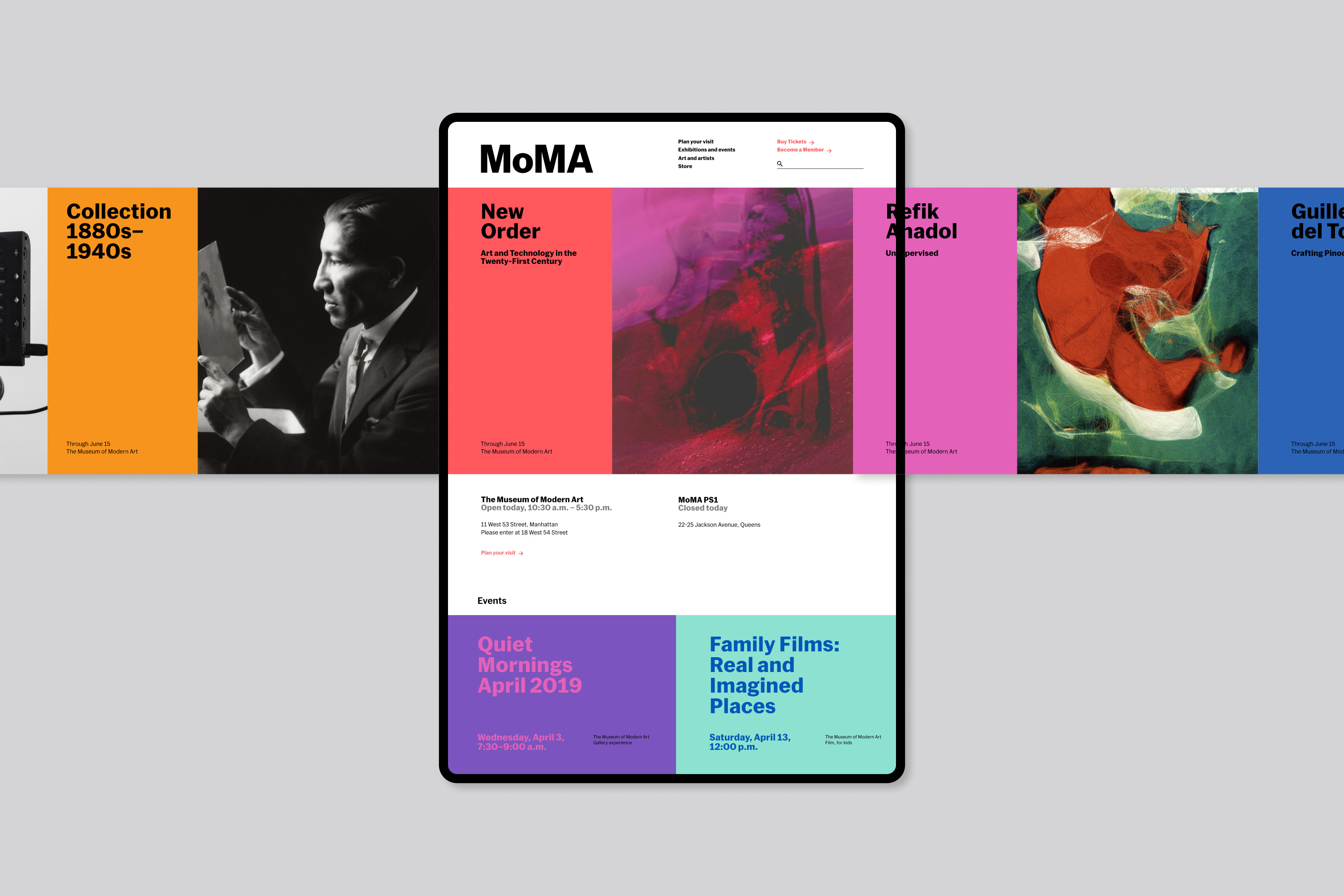
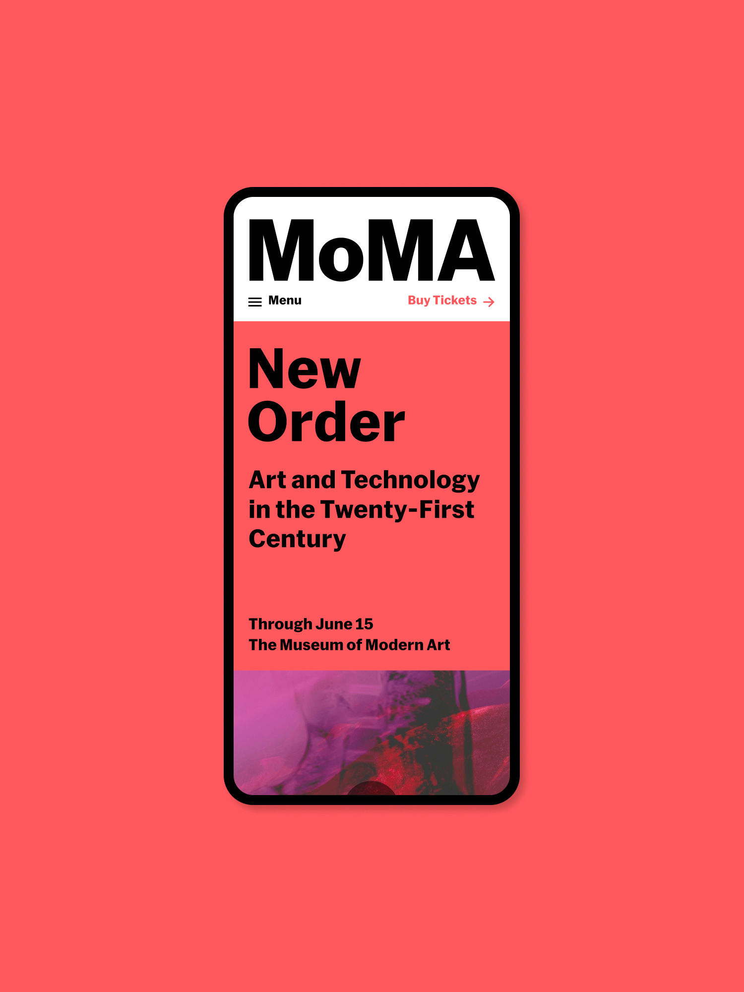
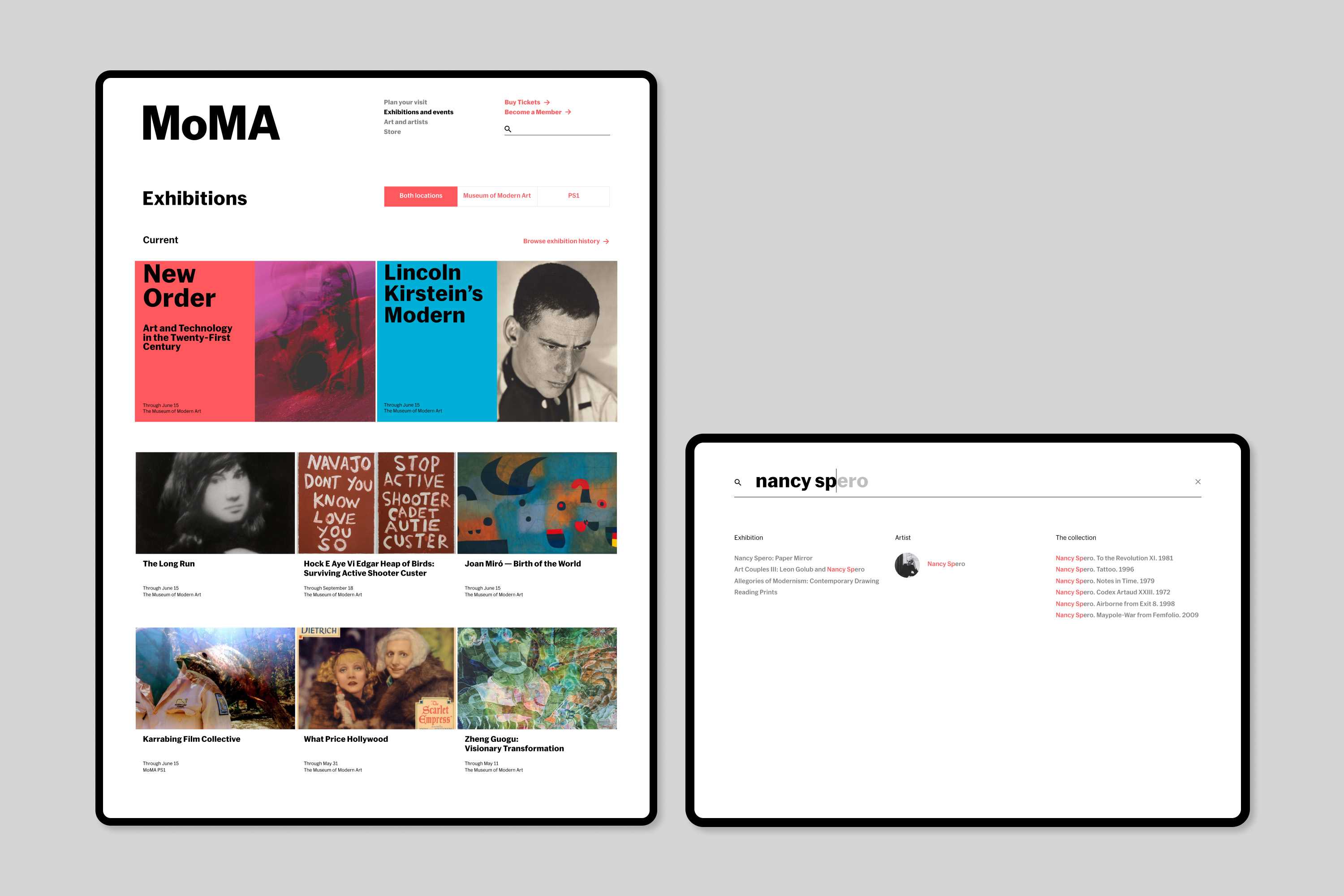
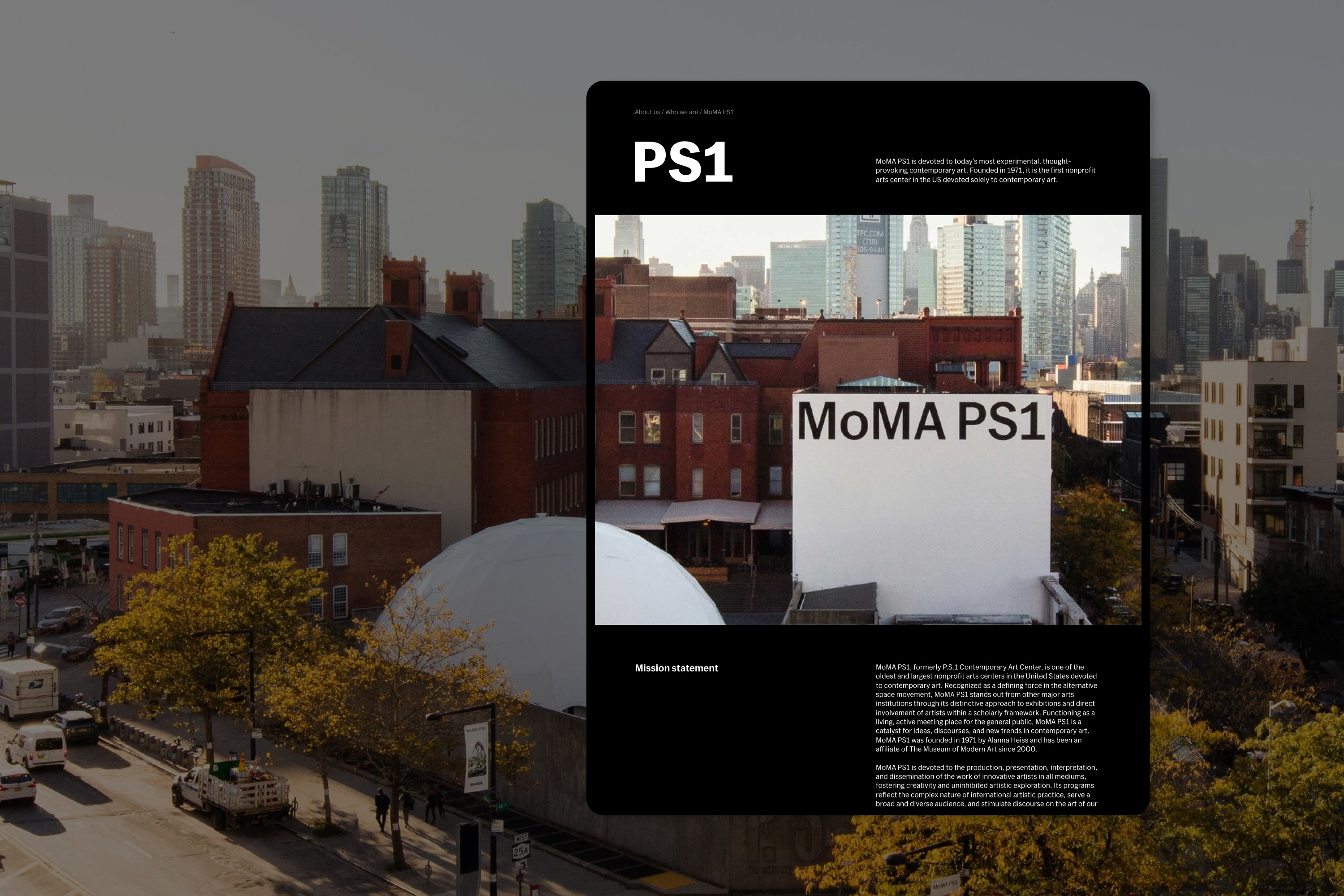
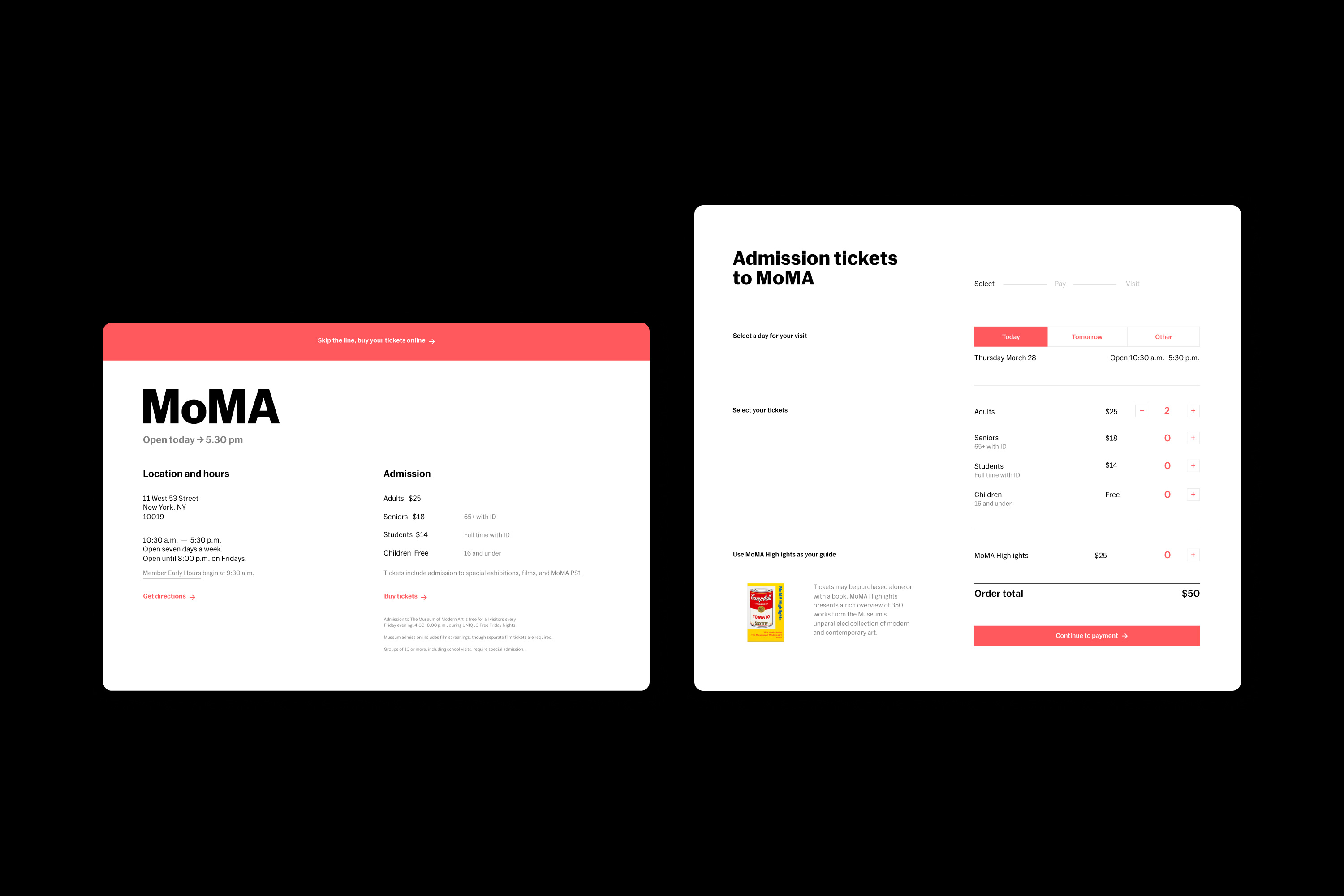
MoMA was undergoing a major redesign and expansion. The new brand articulation was first and foremost developed with the museum’s physical space and print material in mind. Together with the MoMA team G—W designed a concept to bring their new brand onto their digital platforms. The solution made the application of the brand more fluid and responsive, creating a usable digital experience reflecting their new identity.
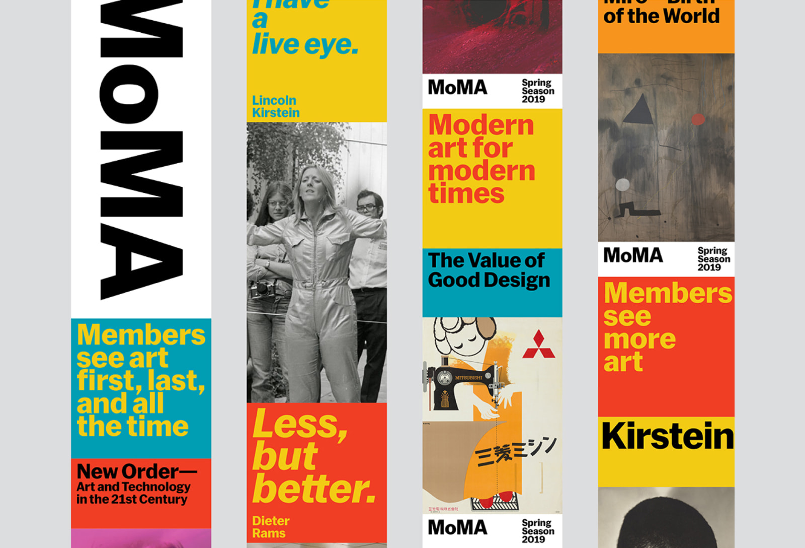
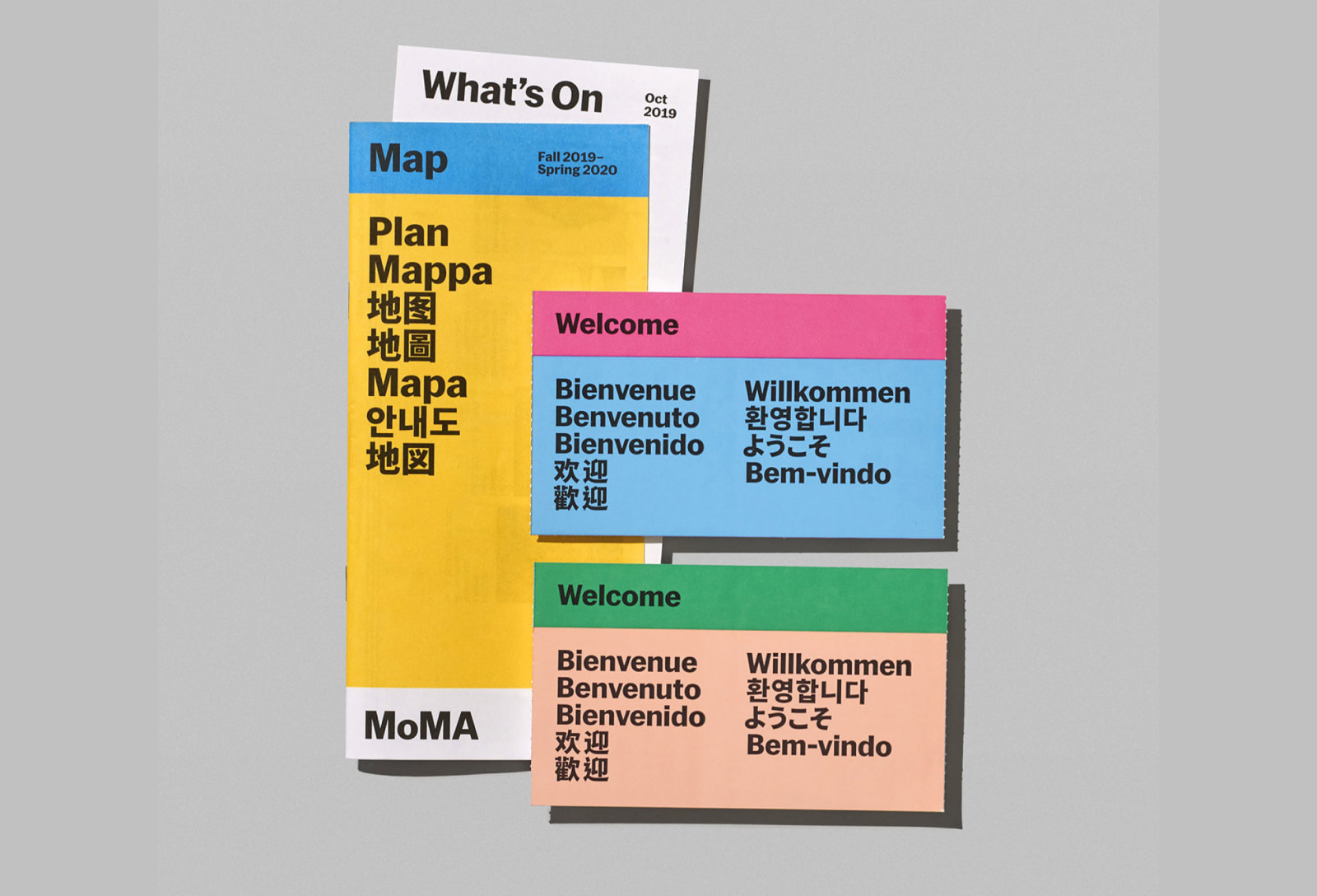
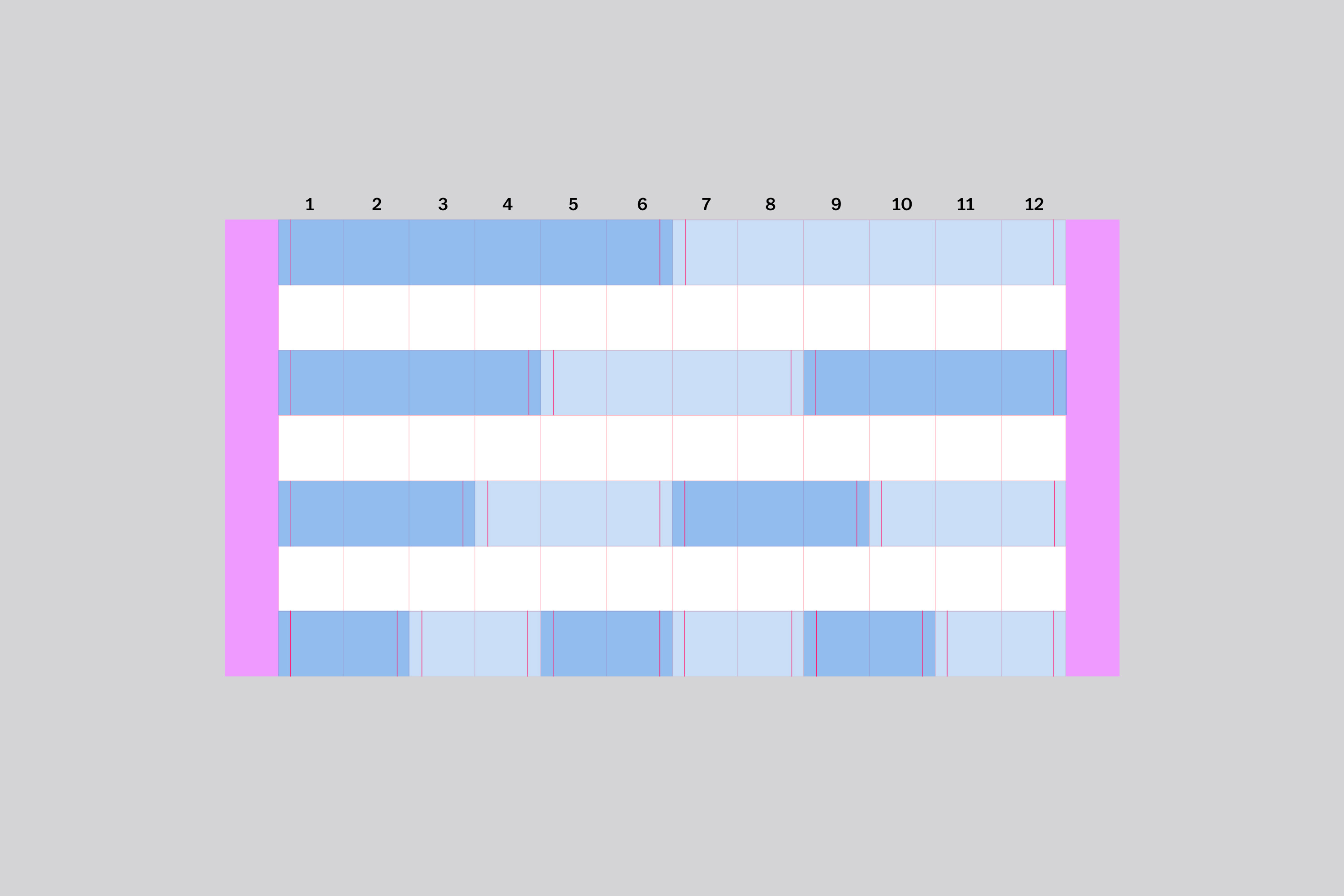
The brand team had created basic column layouts but it was unclear how this translated into a usable digital experience. In response we developed a responsive system based on the 12 column grid to work fluidly across digital applications.
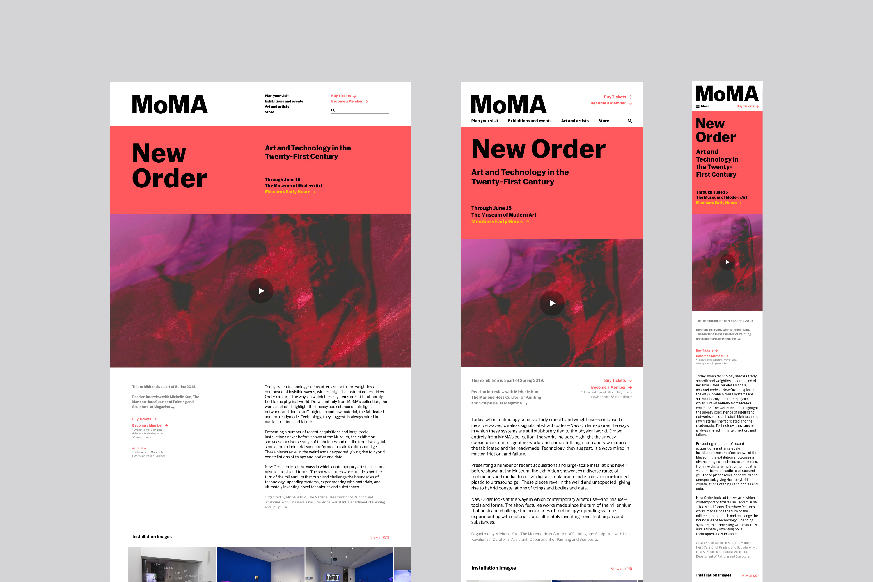
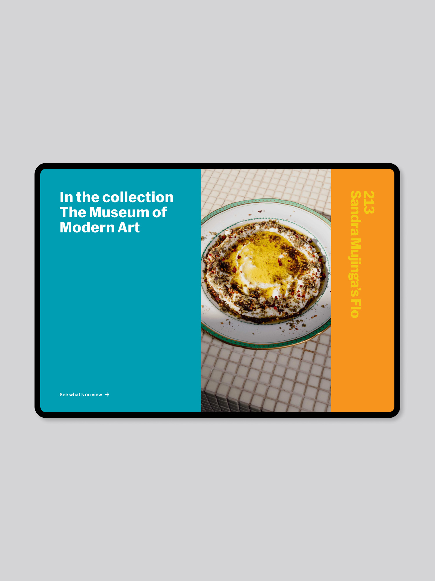
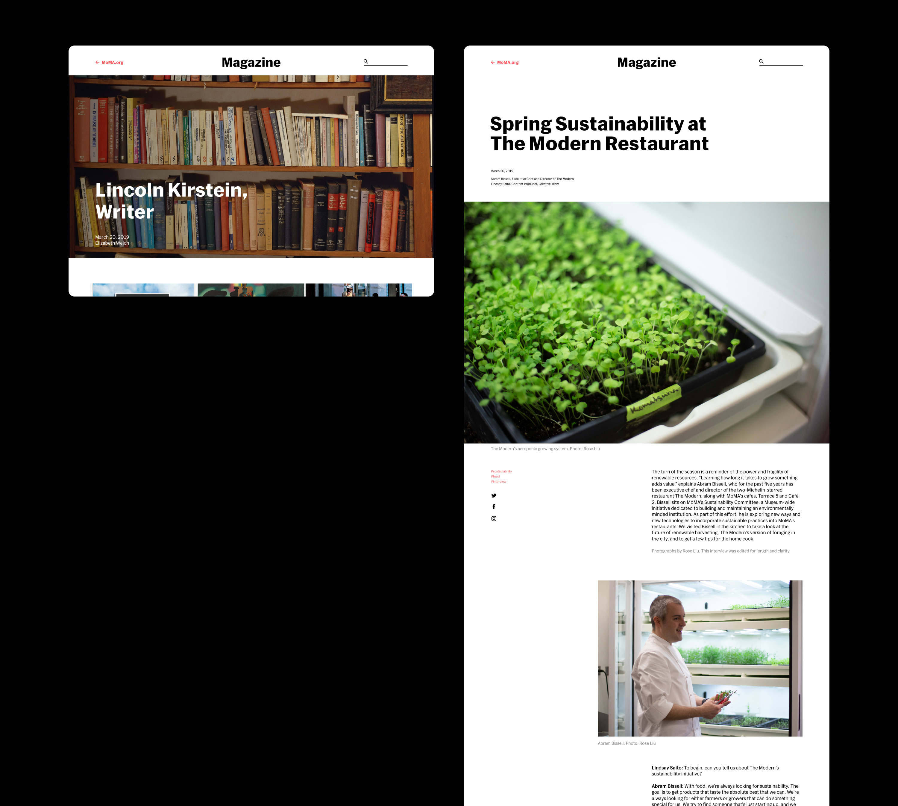
A modular system was established that combines text, image (moving or still), and messaging into large composition.
