Klarna App
Creating a smooother post-purchase experience for shoppers
Deliverables
User testing
Concept design
User Experience
User Interface
Rebranding
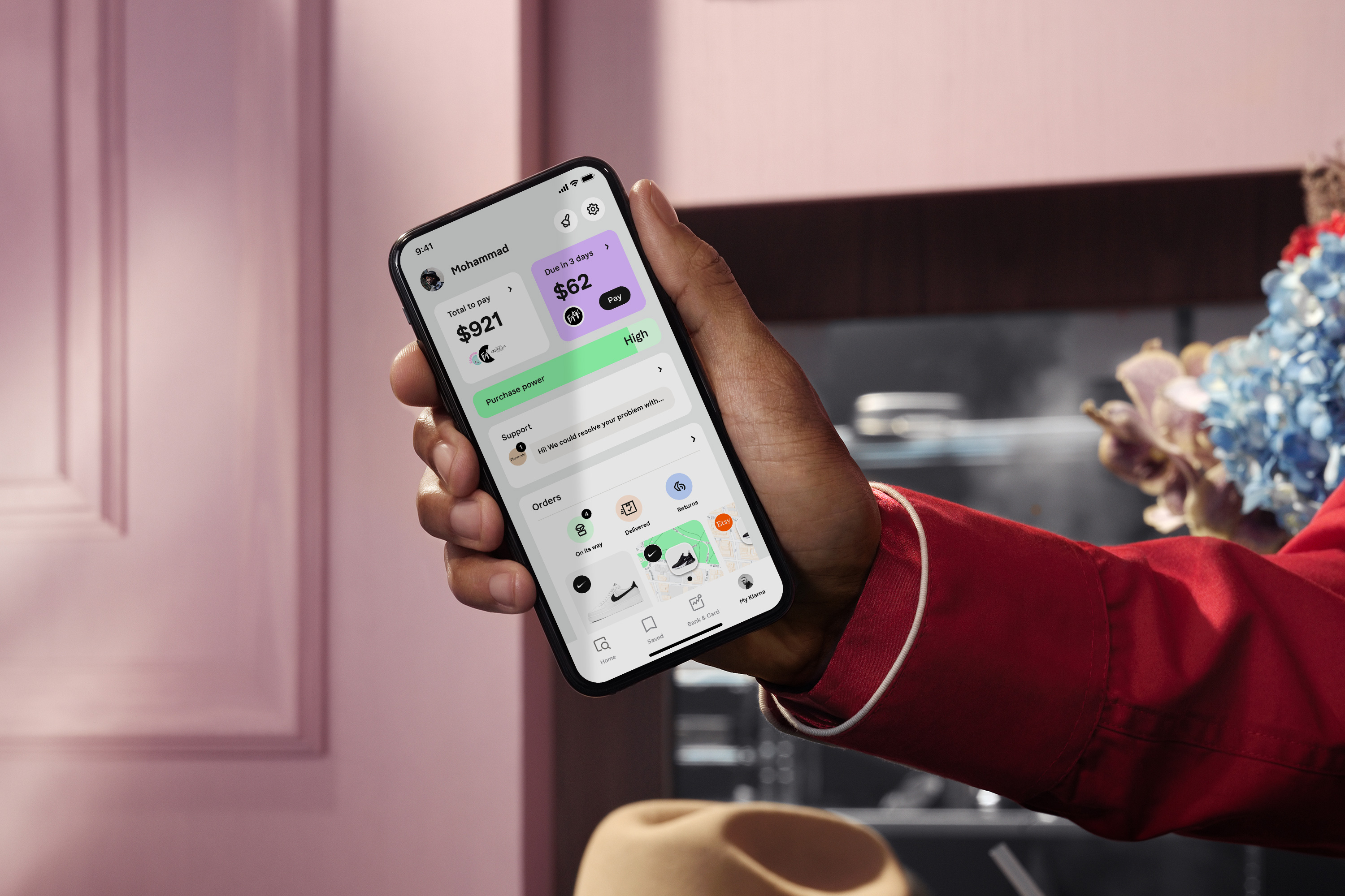
As Klarnas shopping universe grows with more features, staying true to the Smoooth promise becomes more vital by the day. Through extensive user testing and iterations G—W has created designs that are simple and powerful – delivering a Smoooth shopping experience.
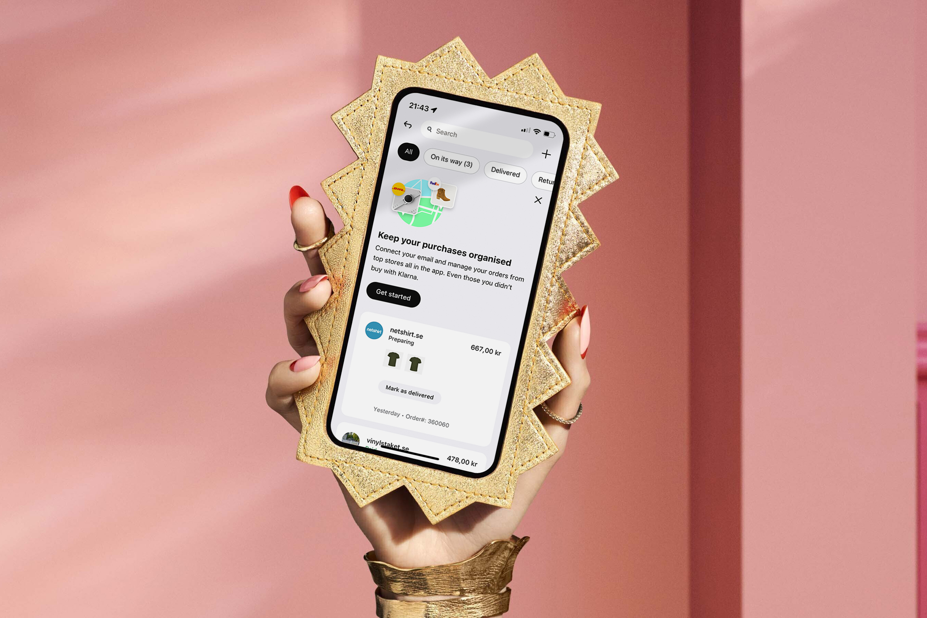
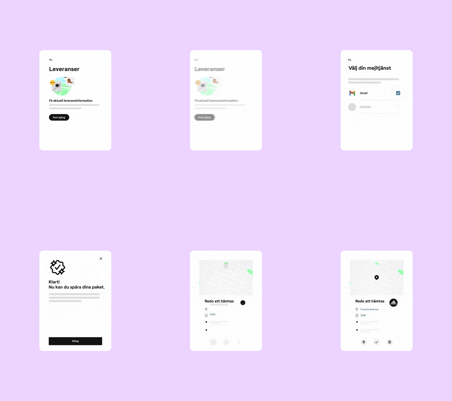
Delivery
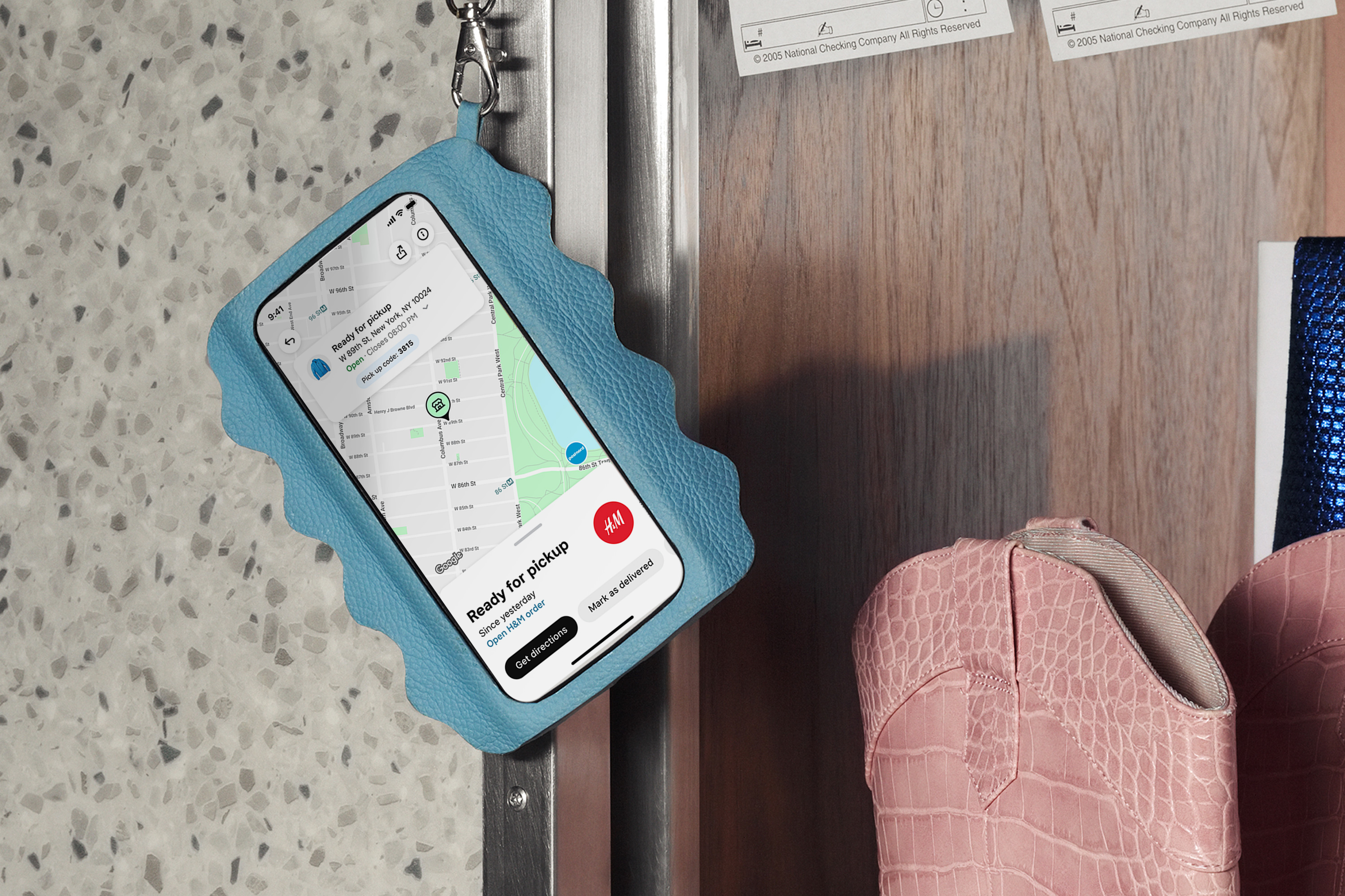
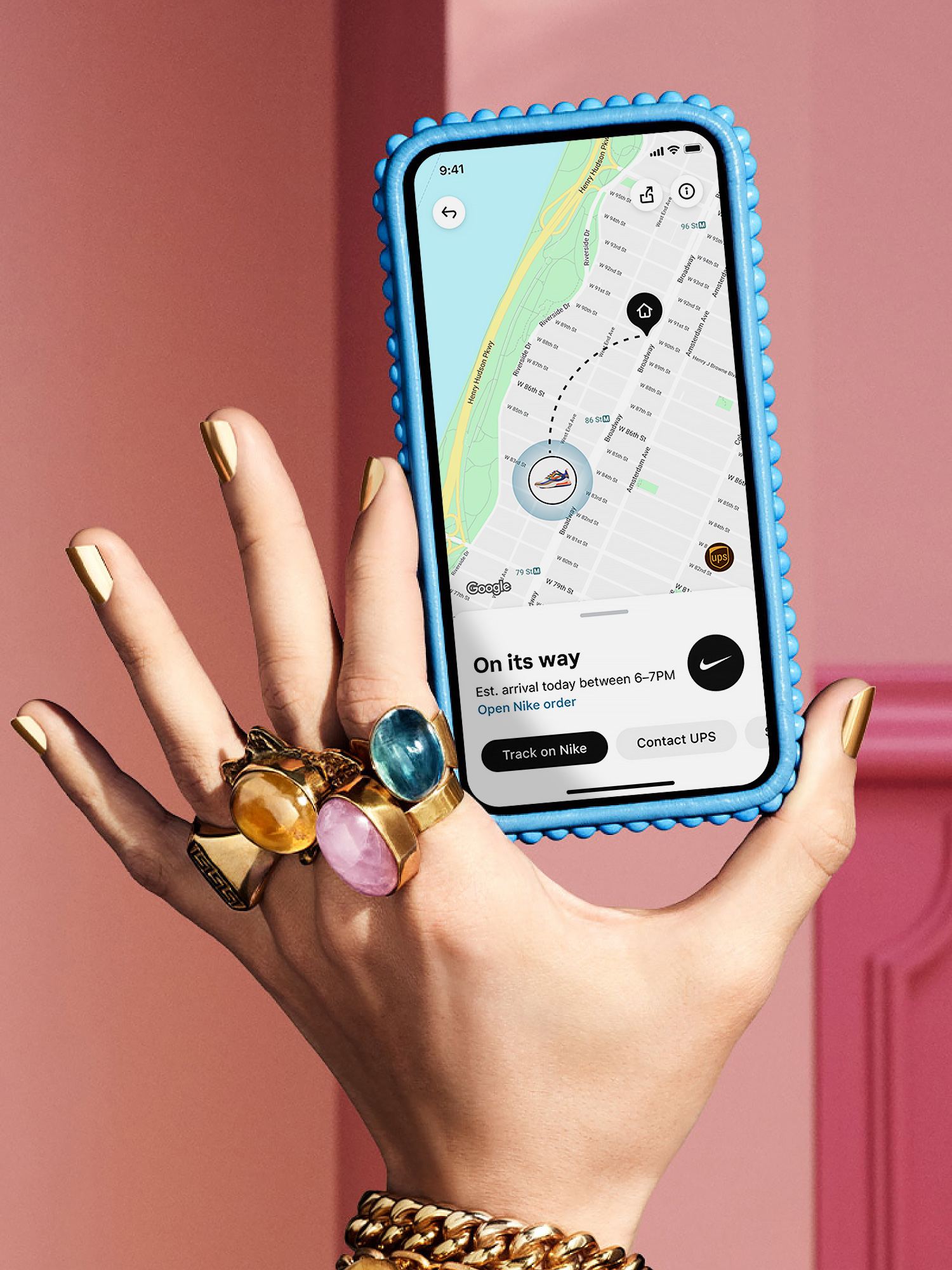
As soon as a purchase has been made, there’s still a long way left on the user journey. Delivery being often times a major cause of concern and therefore leading to customer service errands. We designed a more informative flow that updates the user with key information until the package is delivered.
