Aimo Park
From parking operator to mobility hub
Deliverables
UI Design
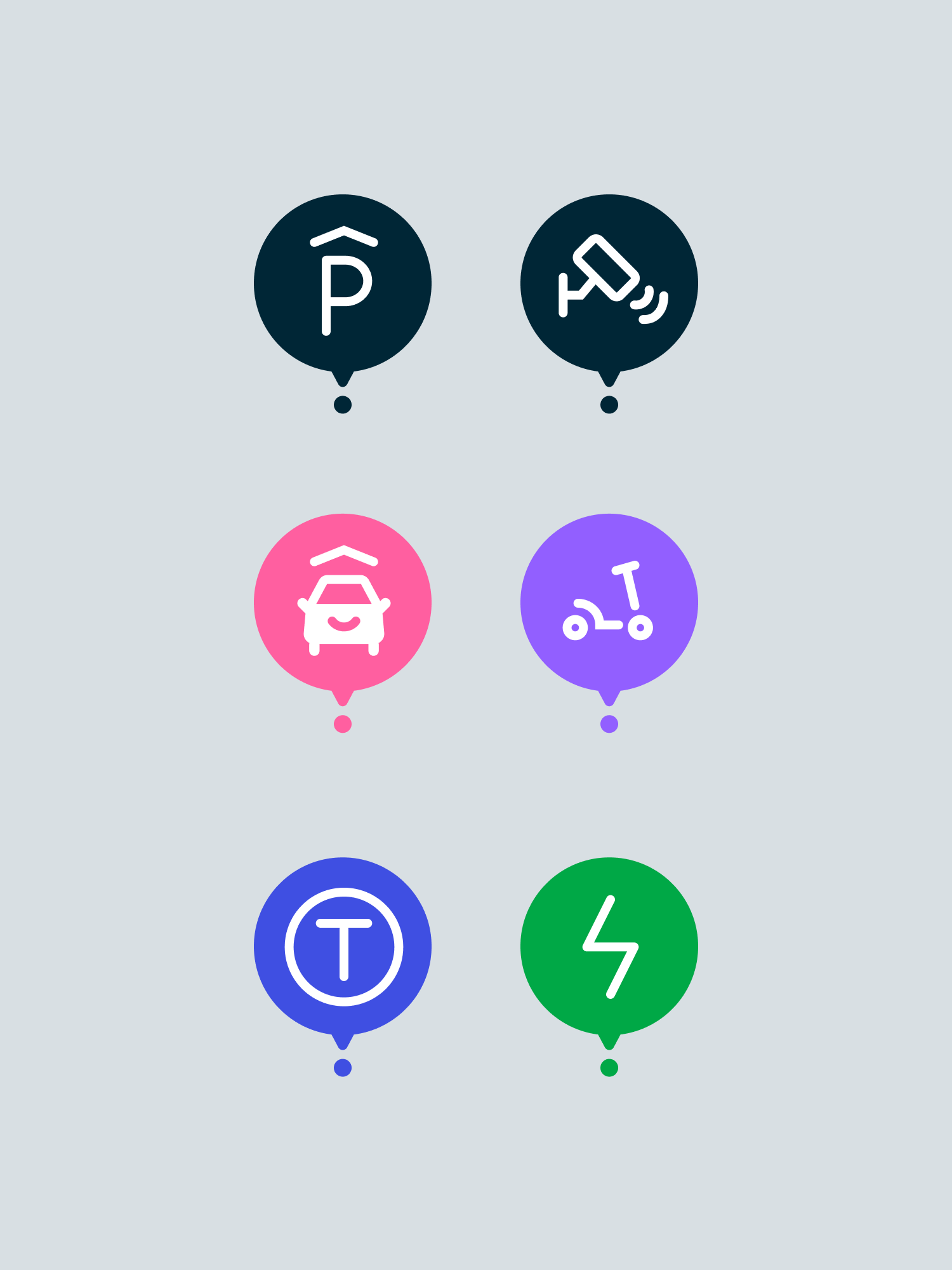
Icon library
Design system
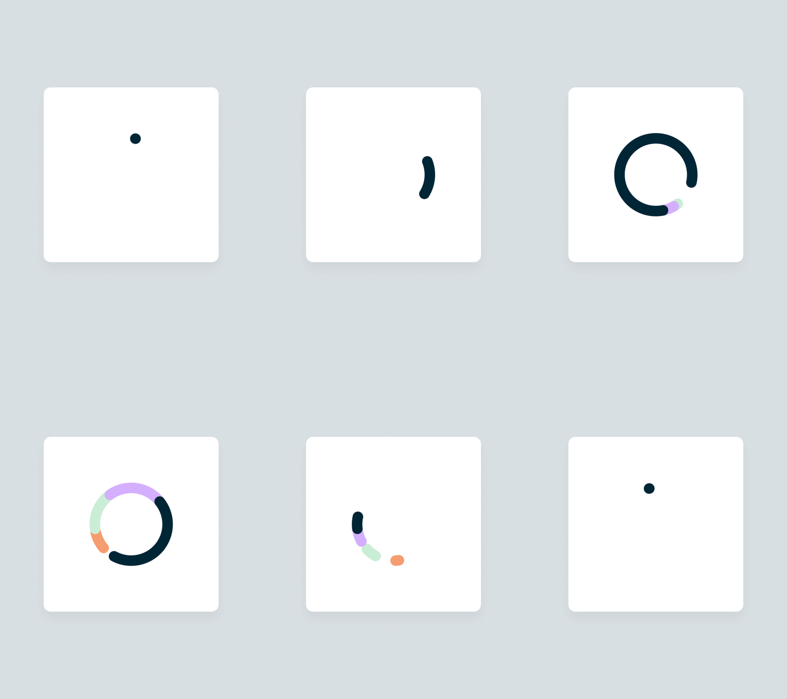
Motion studies
Year
2021
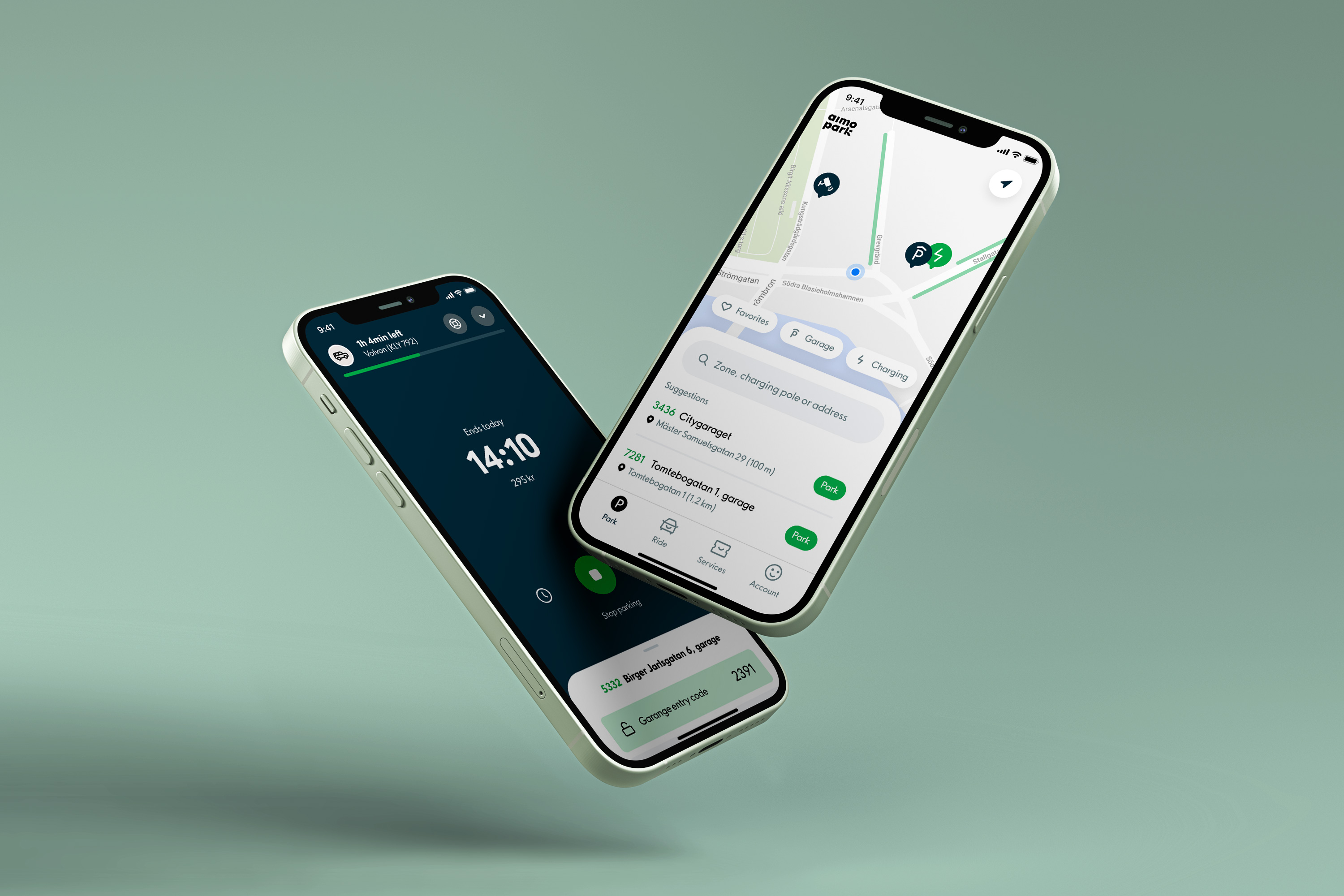
In its mission to move from parking operator to mobility hub Aimo Park set out to combine not only three different apps across three countries, but also their parking and car sharing service into one app. G—W was brought in to design the whole app from scratch and with it help translate their analogue brand into a digital design system.
This app is used while on the move, holds a lot of information and to top it of, it’s a necessary evil in your life. This set some challenging requirements on both interactions and design.
Three core concepts was used to make this design successful; thumb-ability, gestures and branded details
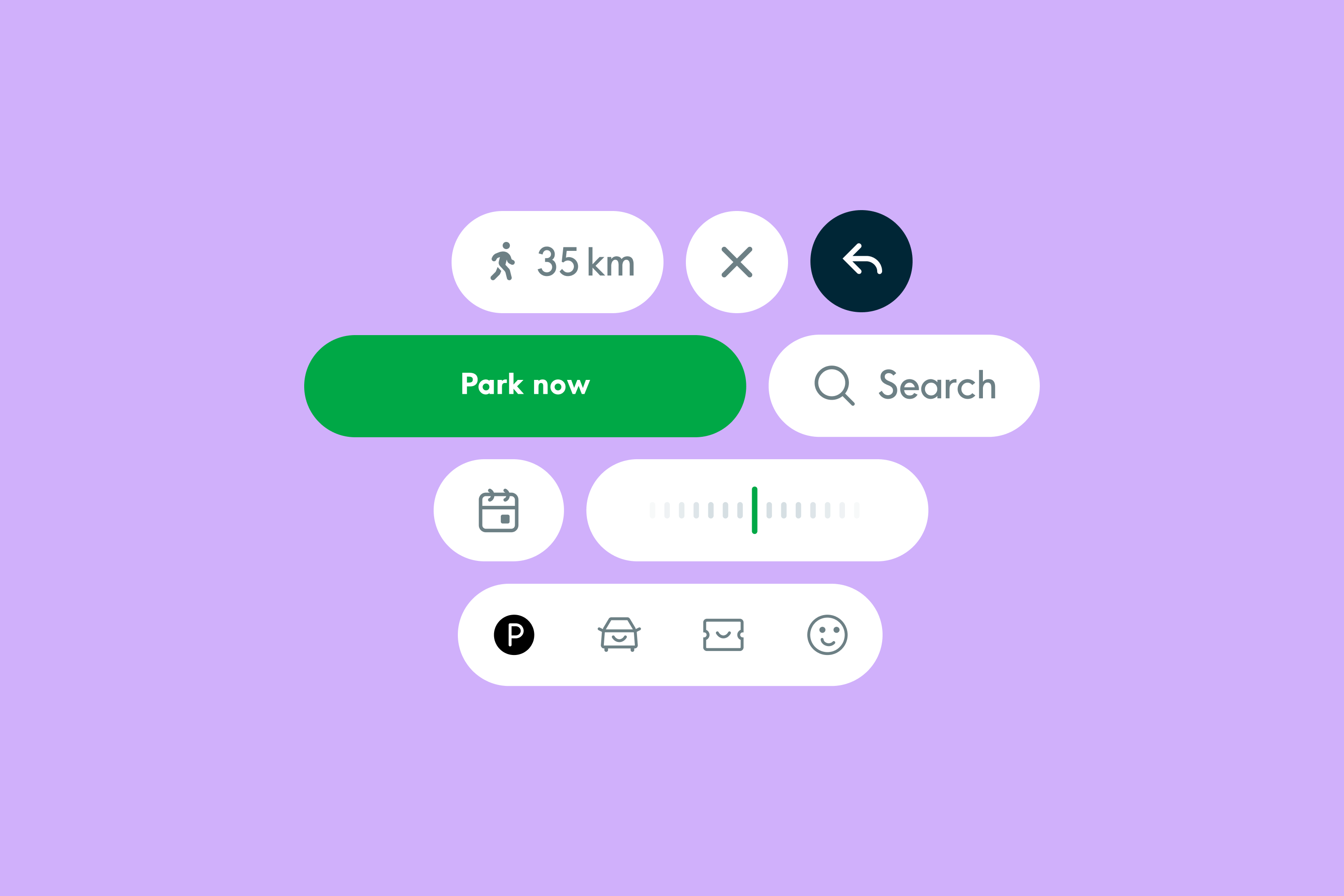
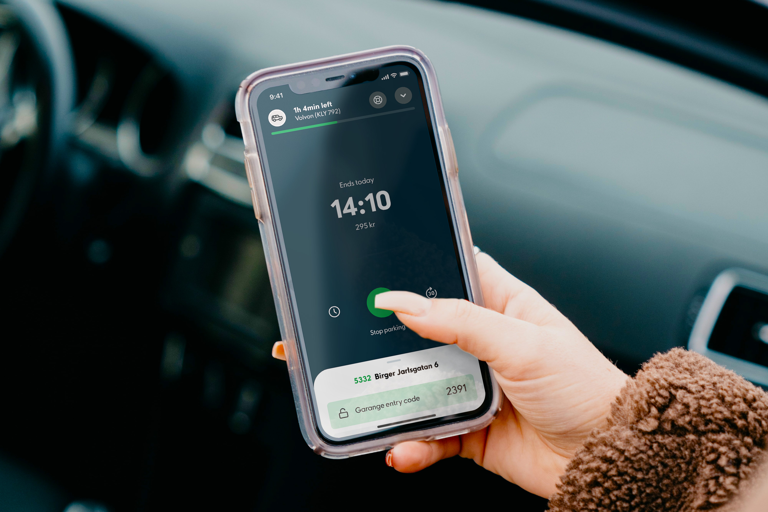
Thumb-ability. Running late for a meeting, carrying your bag in the other hand, we made sure to place all main interactions within reach of your thumb.
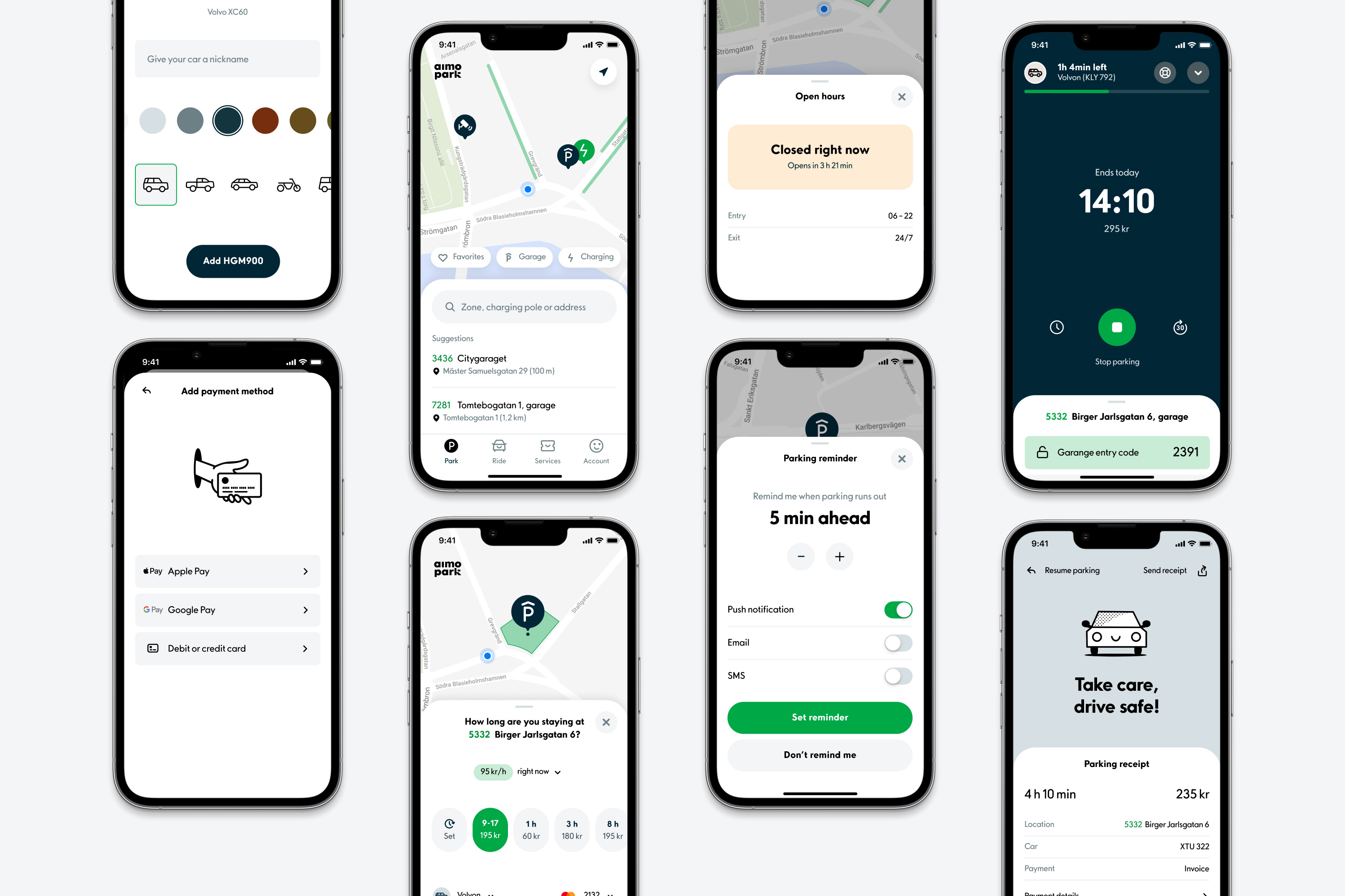

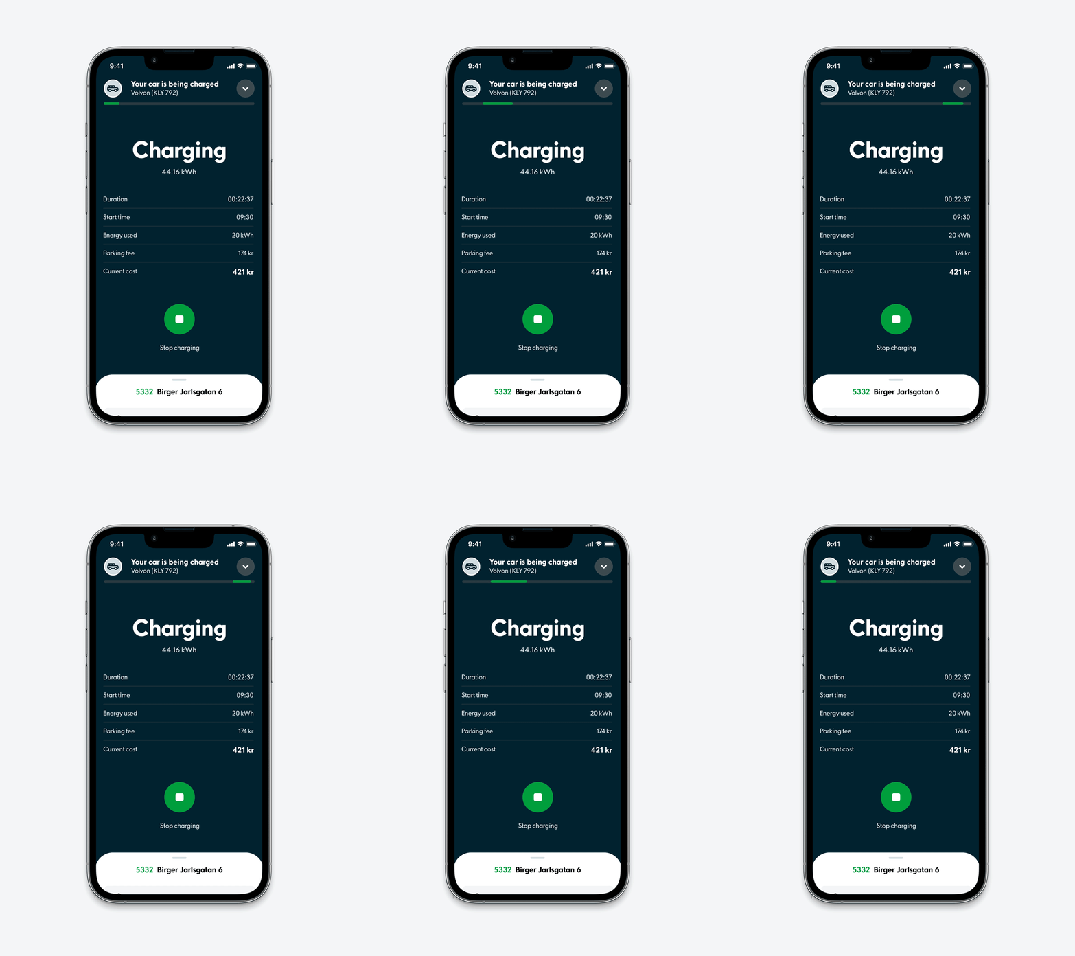
Gestures. The foundational layout of the app uses modules that are easily manipulated by gestures. Swipe up for more info – down to dismiss.
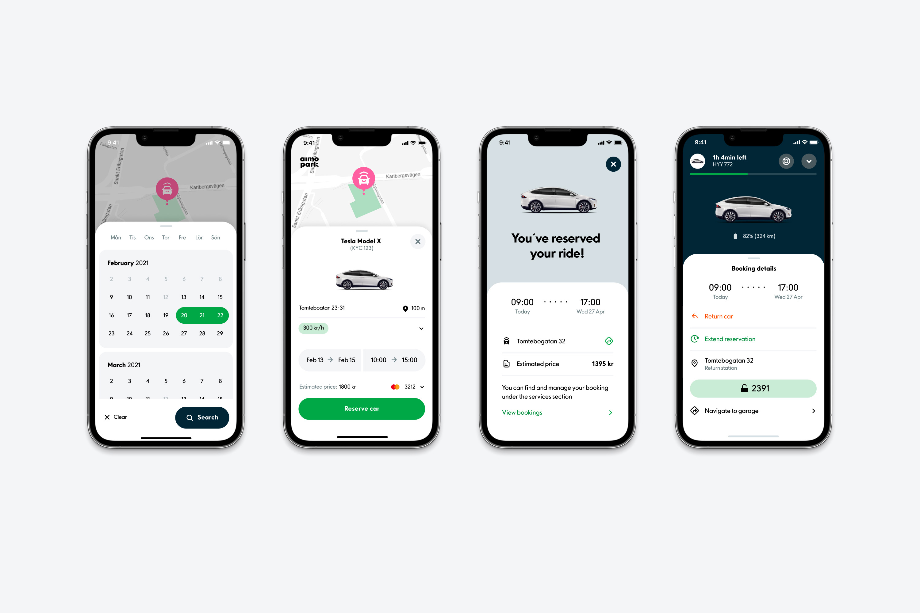
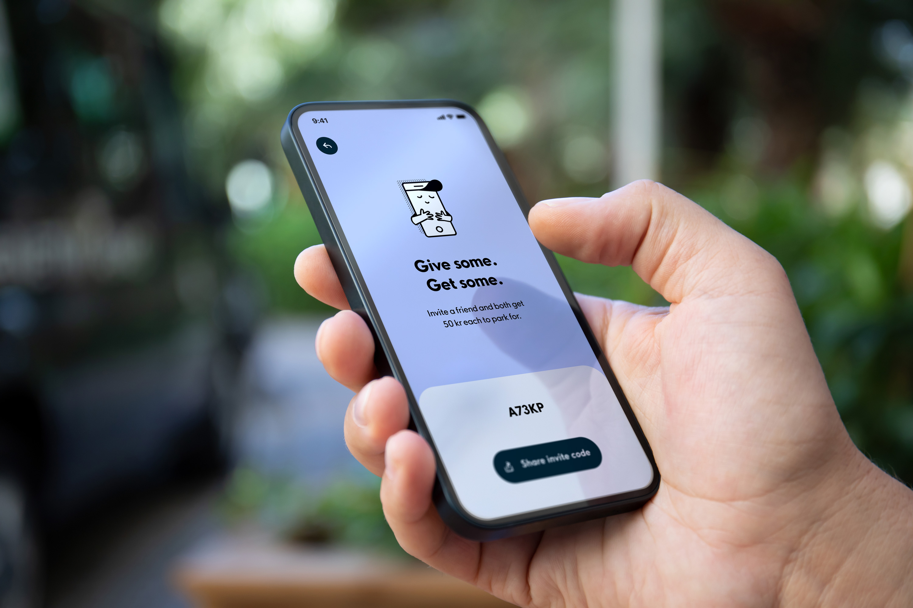
Branded details. Let’s be honest, most parking apps are boring to use and looks the part. We brought in key elements from the Aimo brand such as colors, rounded details and illustrations to design an experience that’s enjoyable, not just functional.

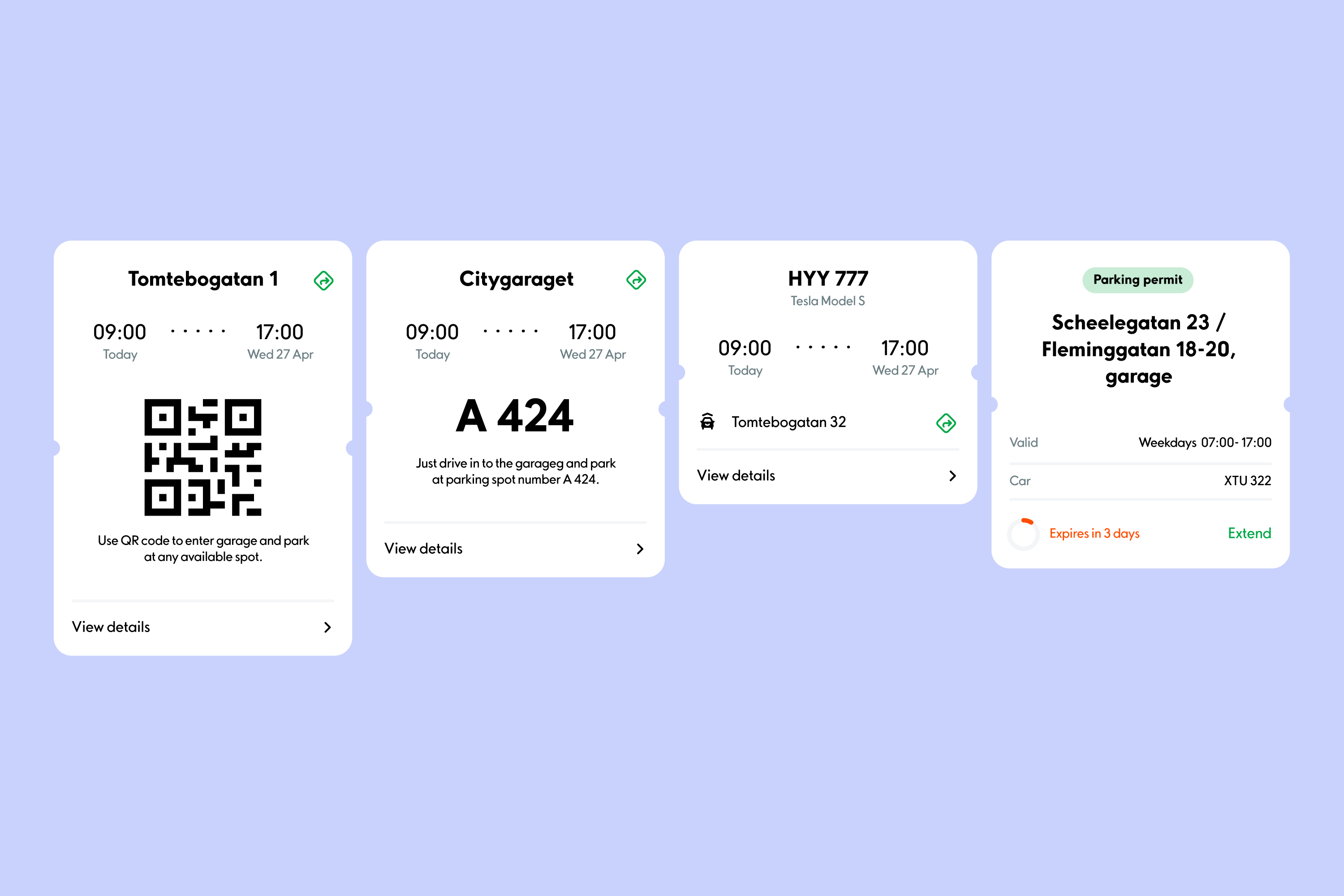
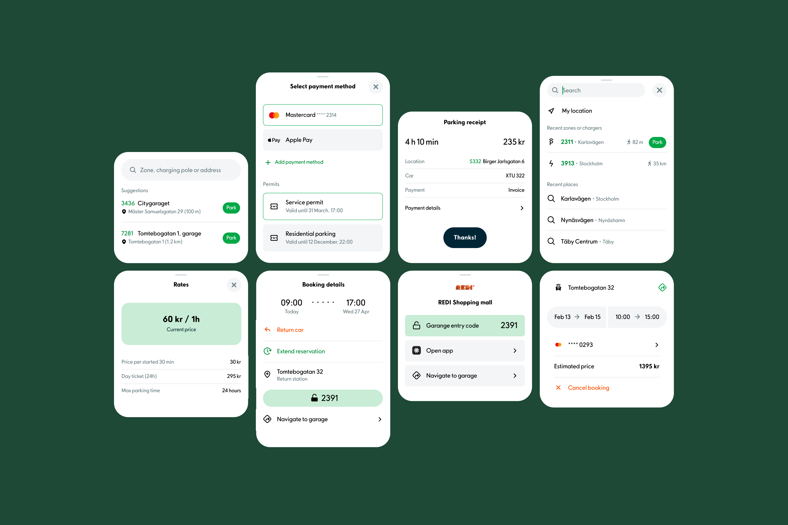
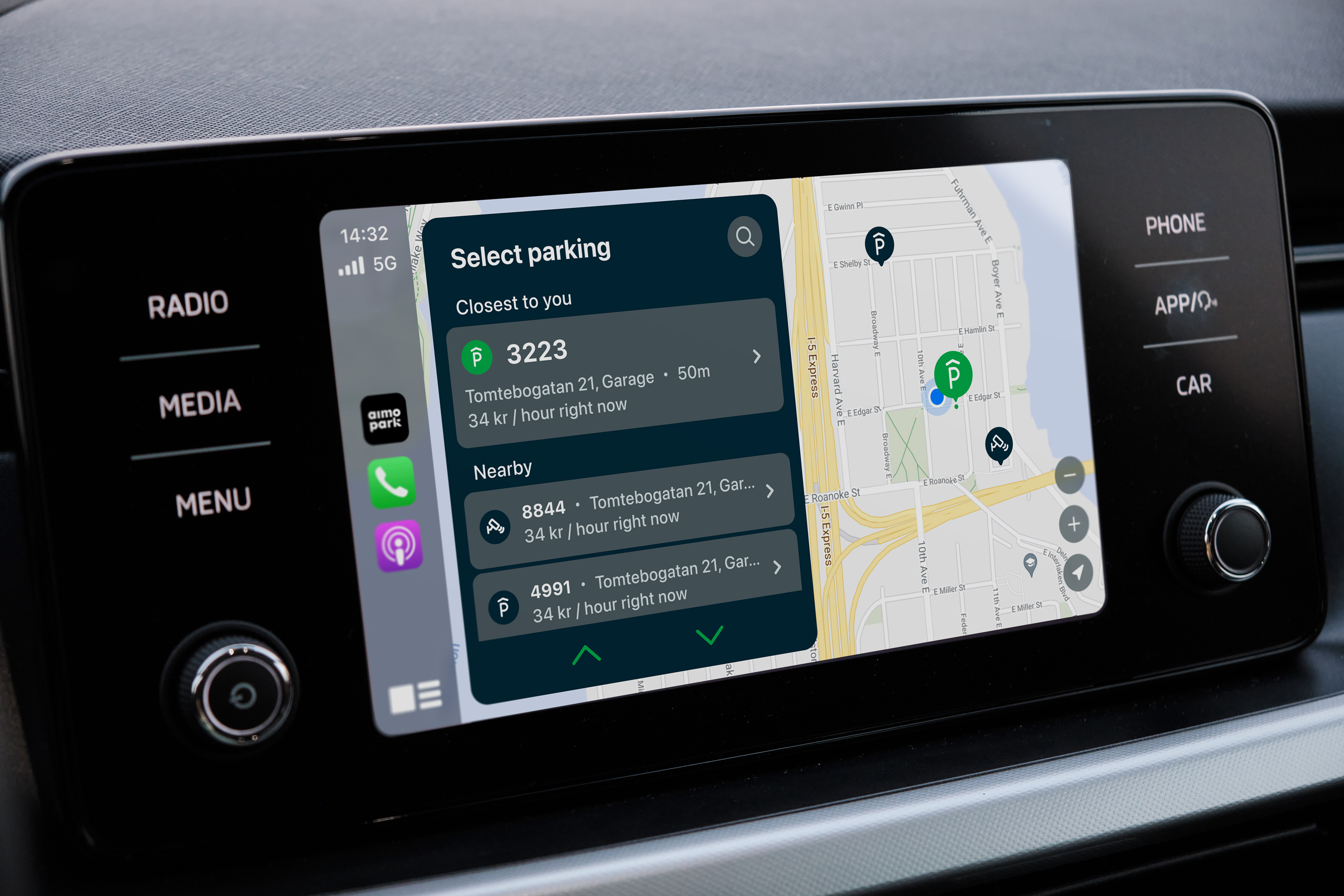
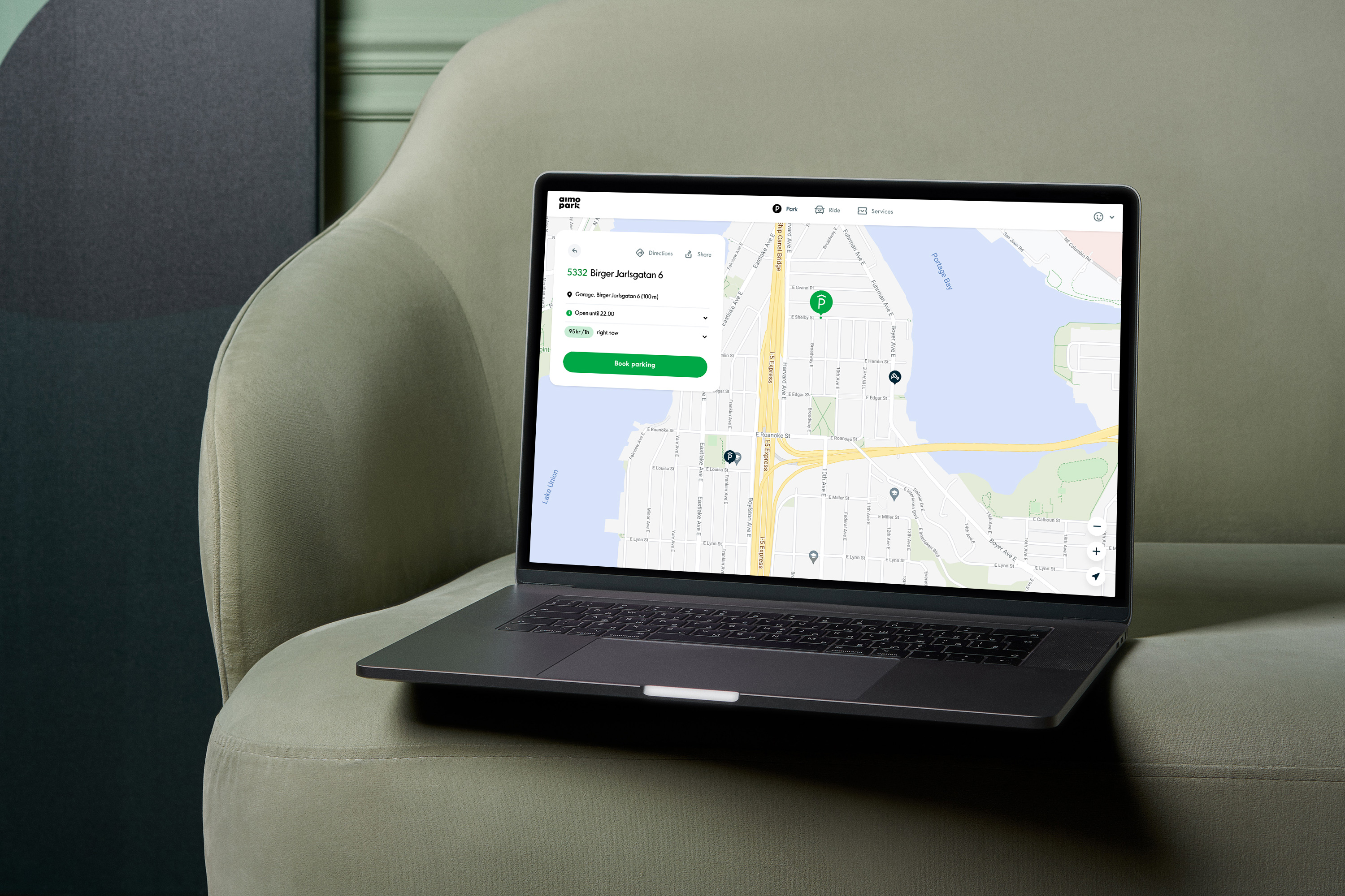
The modular design system allowed us to easily scale the app to multiple platforms.
