GV
A new brand transforming Google Ventures to GV
Deliverables
Visual identity
Website design & development
Year
2018
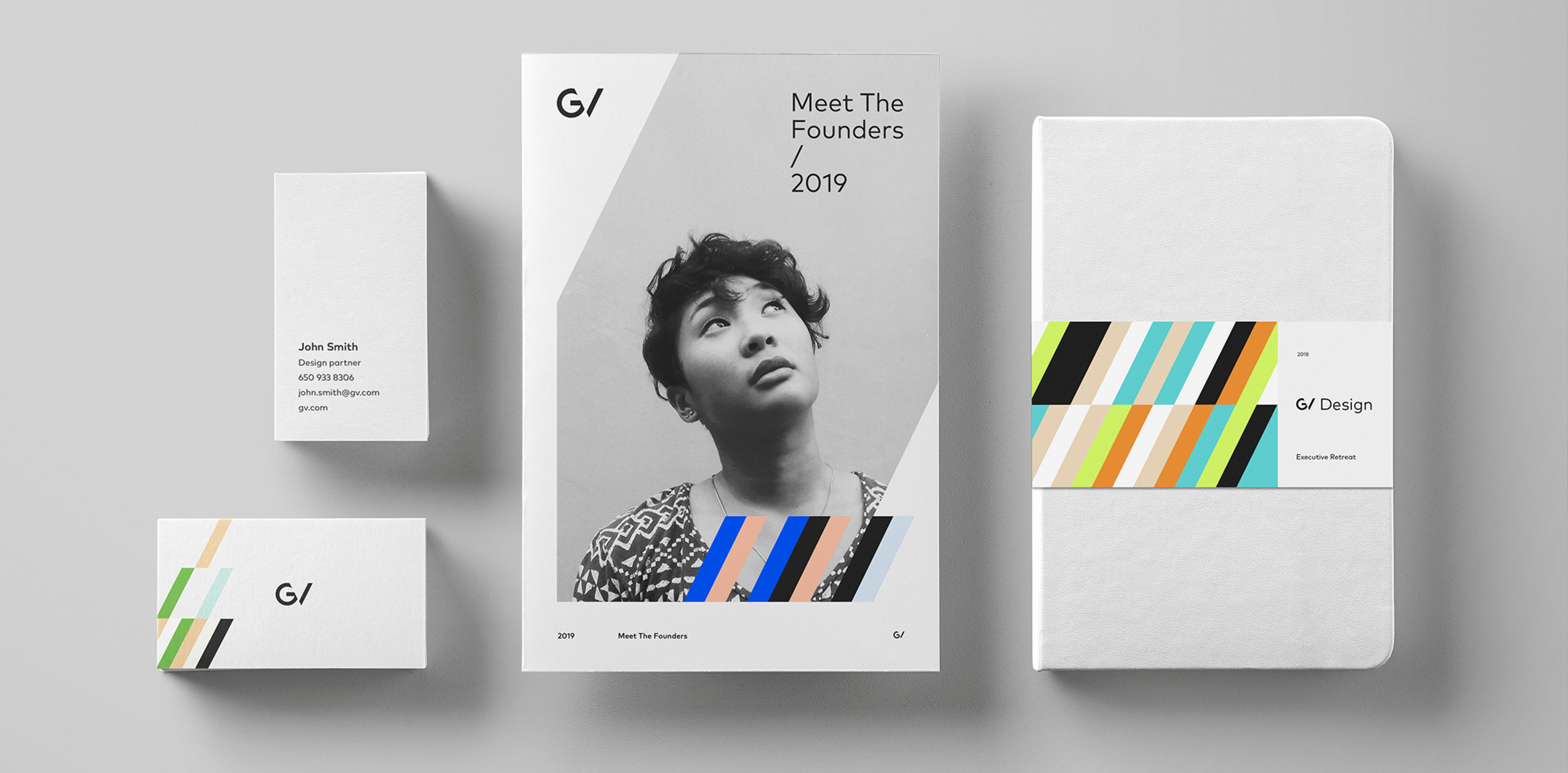
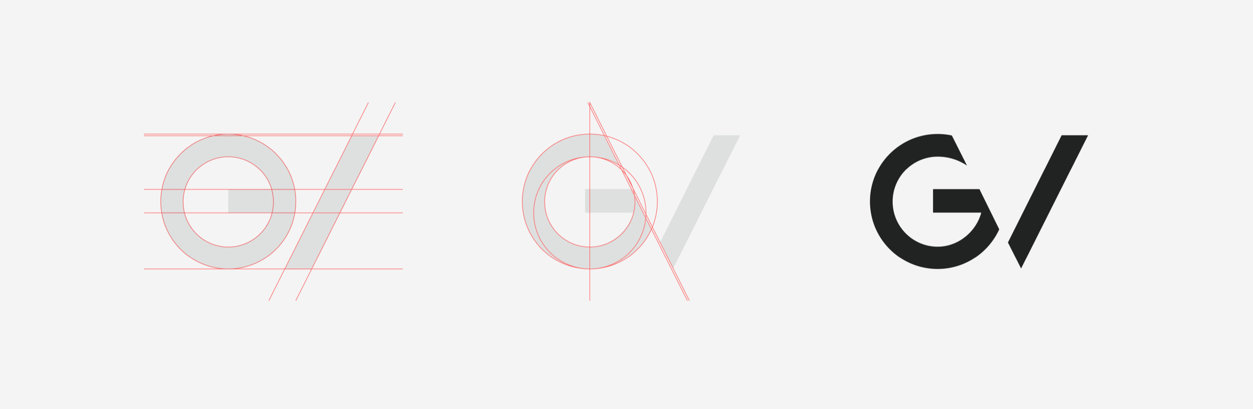
The foundation of the new GV identity is based on the colors of GV’s portfolio companies as well as a slimmer version of the Google G. The V in the logo is created by a negative space between the cut G and the slash-like image. The slash is a metaphor for the intersection between Google and the portfolio companies which is what makes GV what it is today. This metaphor echoes throughout the whole application of the visual identity with large slashes as layout elements & multiple color patterns based on brand colors from portfolio companies. Even the GV website has a unique layout system and color themes based on this metaphor.
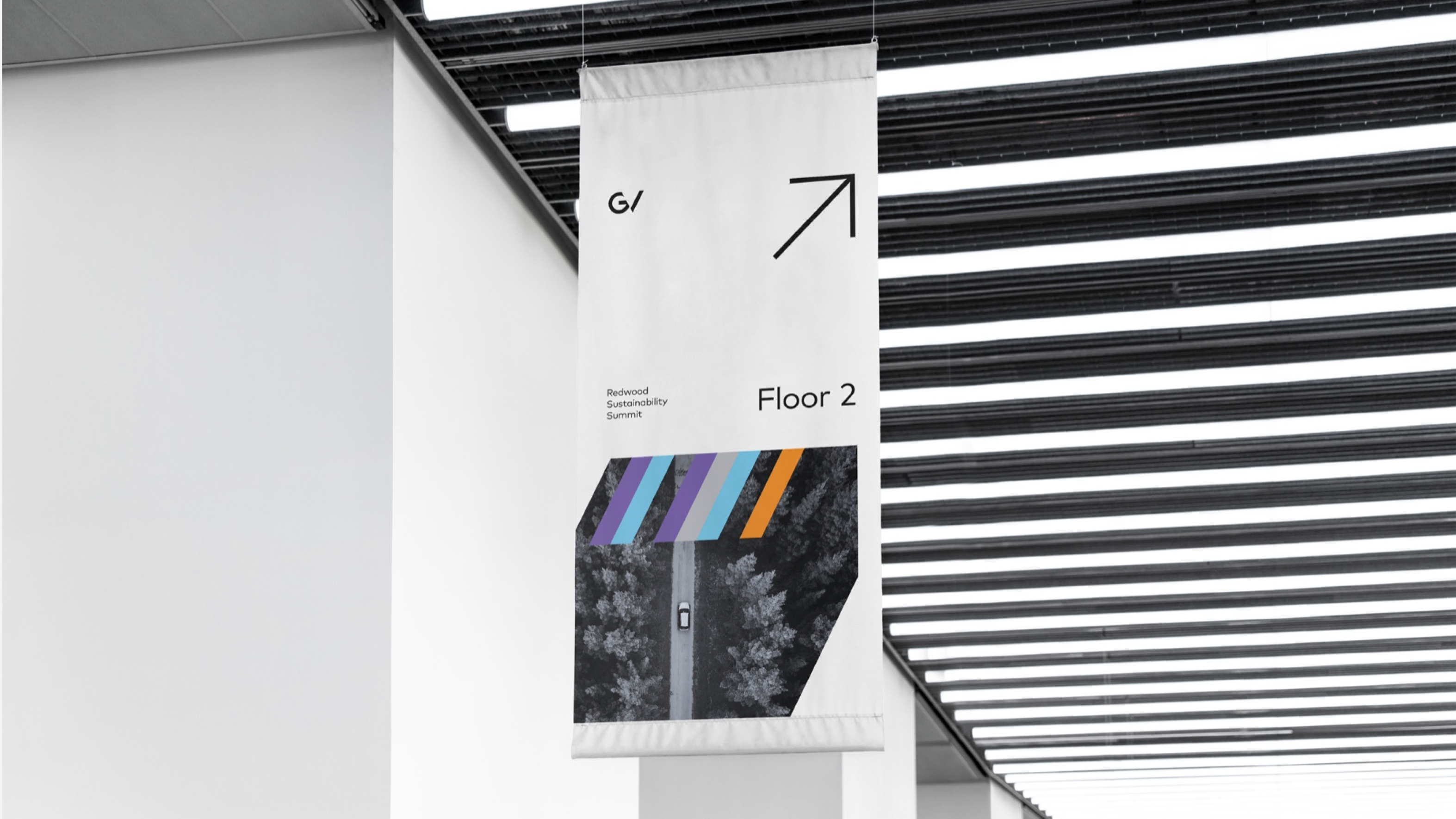

“The slash” symbolizes the intersection between investor and investment. Without each other neither would exist. The slash can be used in many different ways. As a super graphic on it’s own but more commonly as a pattern with colors. Large slashes can also be used to crop images and create grids for layouts.