Round2
Branding the next generation of software funding
Deliverables
Brand Platform
Messaging
Visual Identity
Website
As Europe’s leading provider of revenue-based financing, Round2 Capital has created a new path for entrepreneurs to grow their businesses. Looking to create a brand that reflects the firm’s pioneering spirit, the executive team at Round2 turned to G—W.
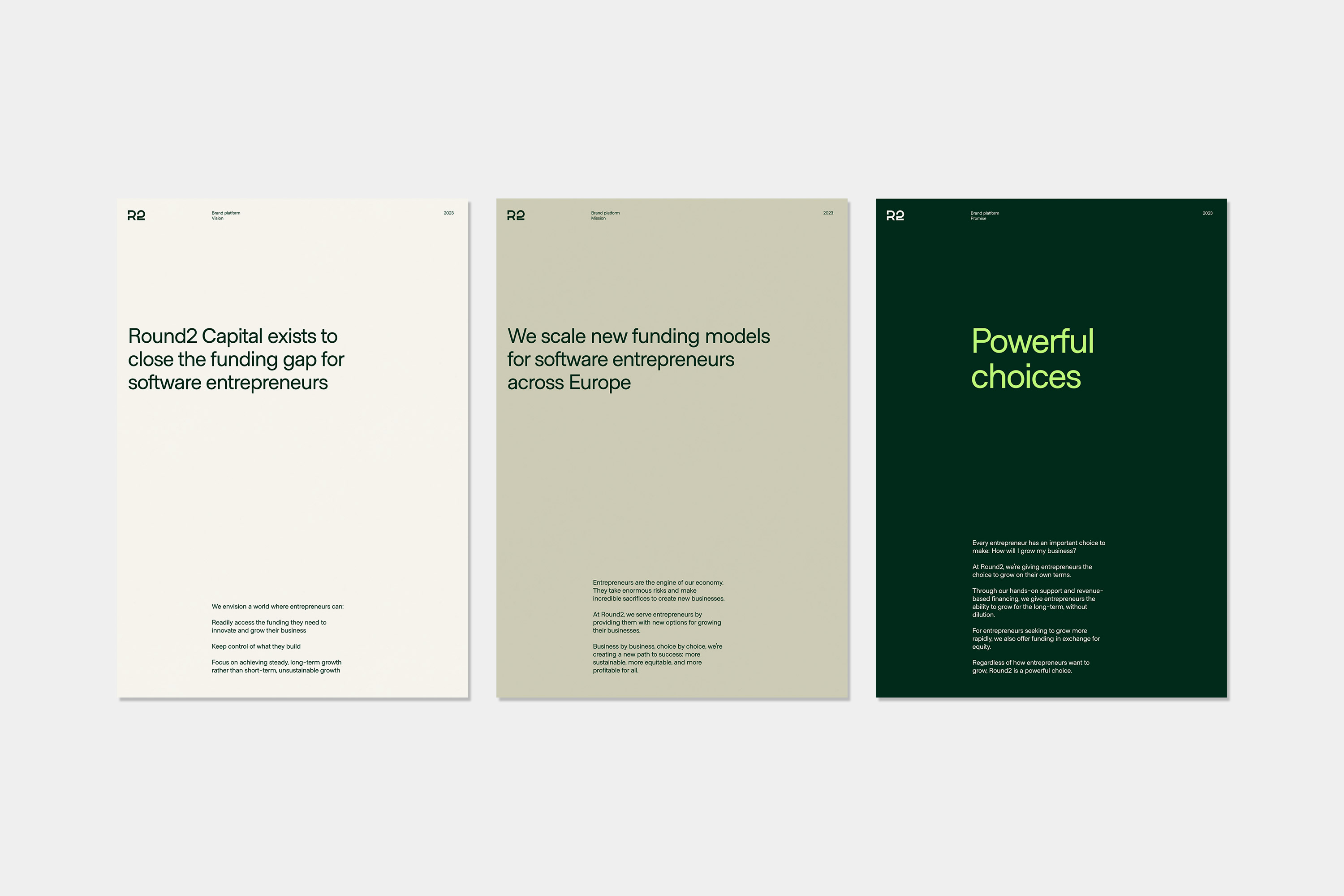
Brand platform
Round2 has existed for nearly a decade and the team already had a strong sense of who they were and what they stood for. Unlike traditional VC funding, Round2 financing allows entrepreneurs to grow their business without dilution. Our first step was to create a brand foundation that captured and distilled the team’s ideas.

Design principles
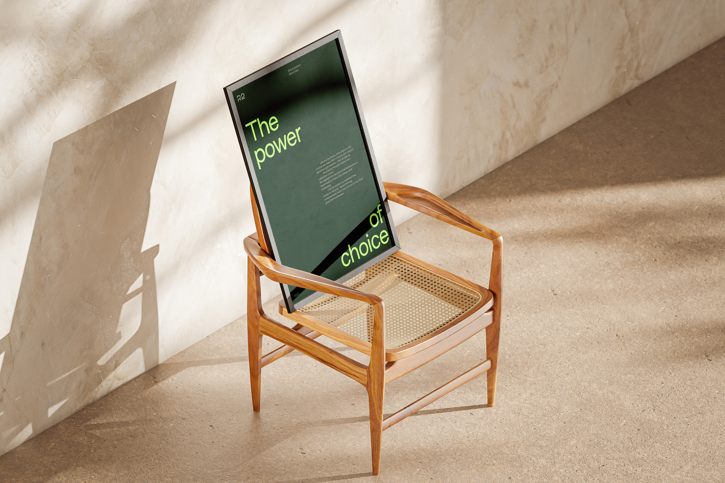
The design philosophy hinged on four core values: Simple, Transparent, Progressive, and Performance.
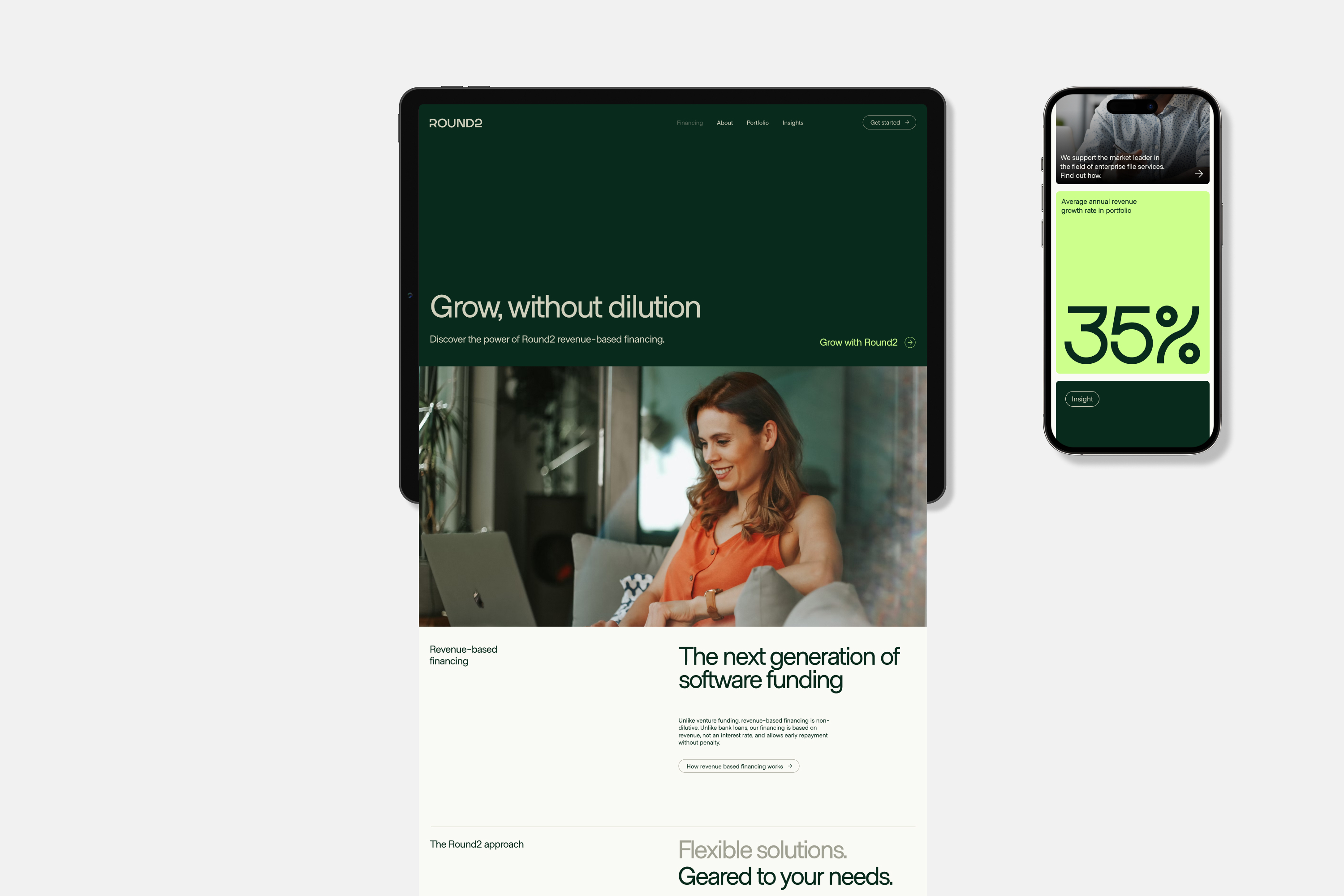
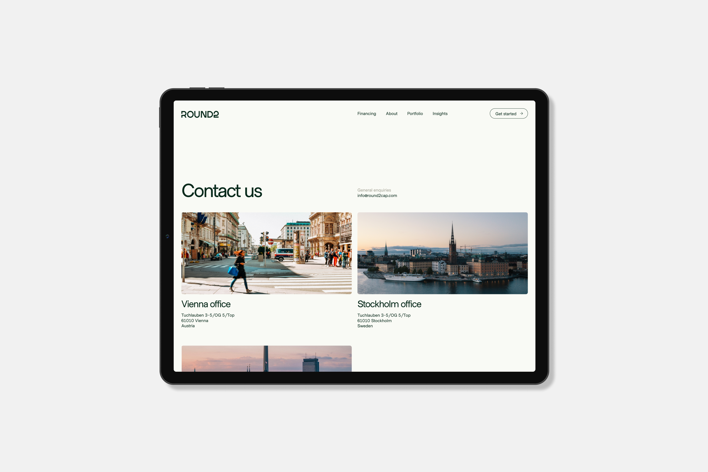
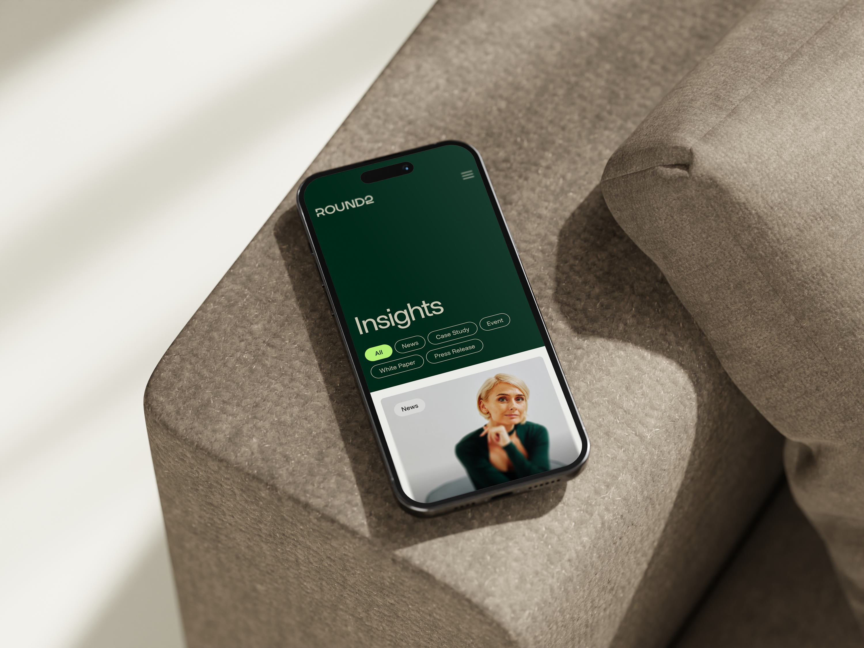
We embodied “Simple and Transparent” through a relaxed and approachable photography style and simple typography.
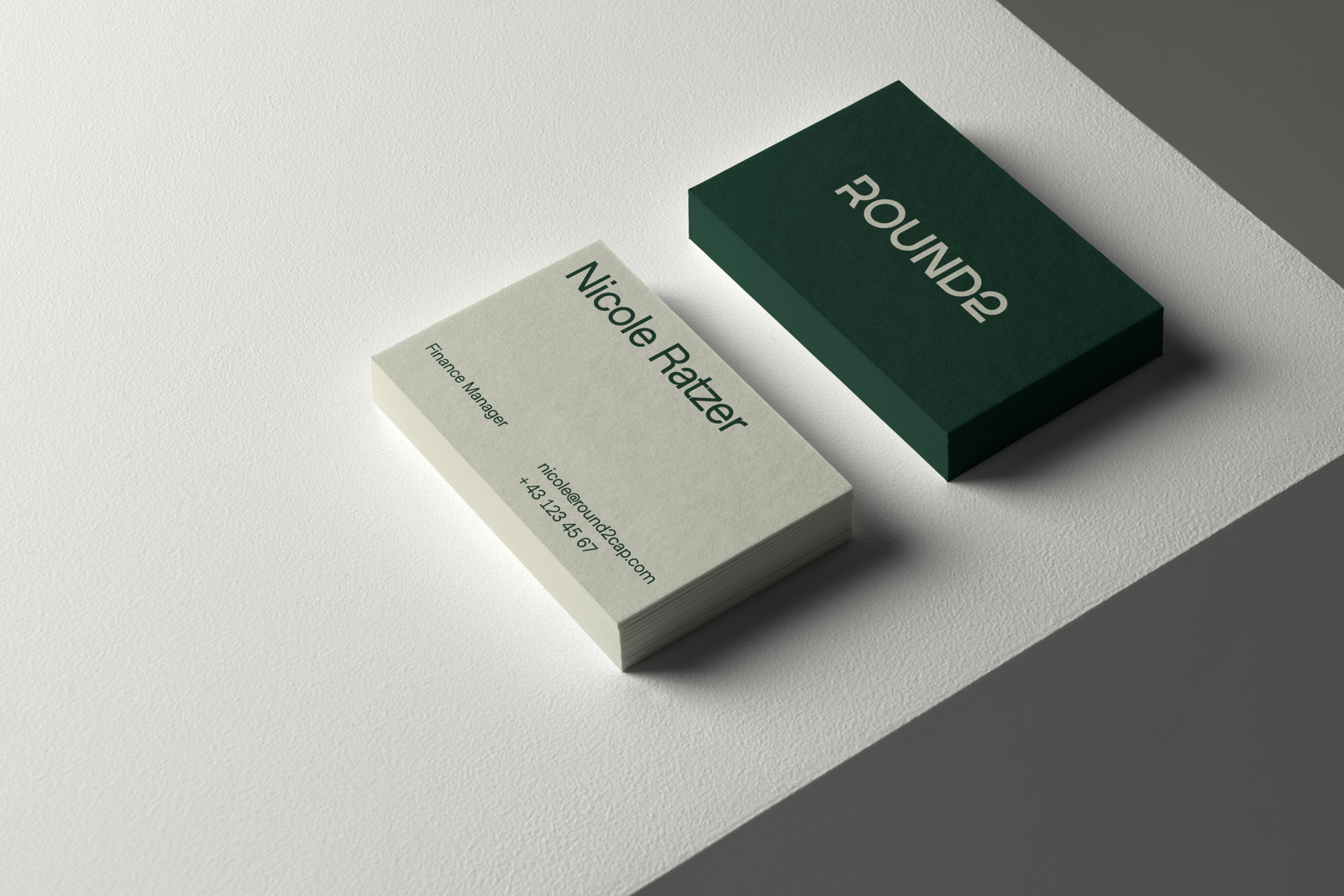
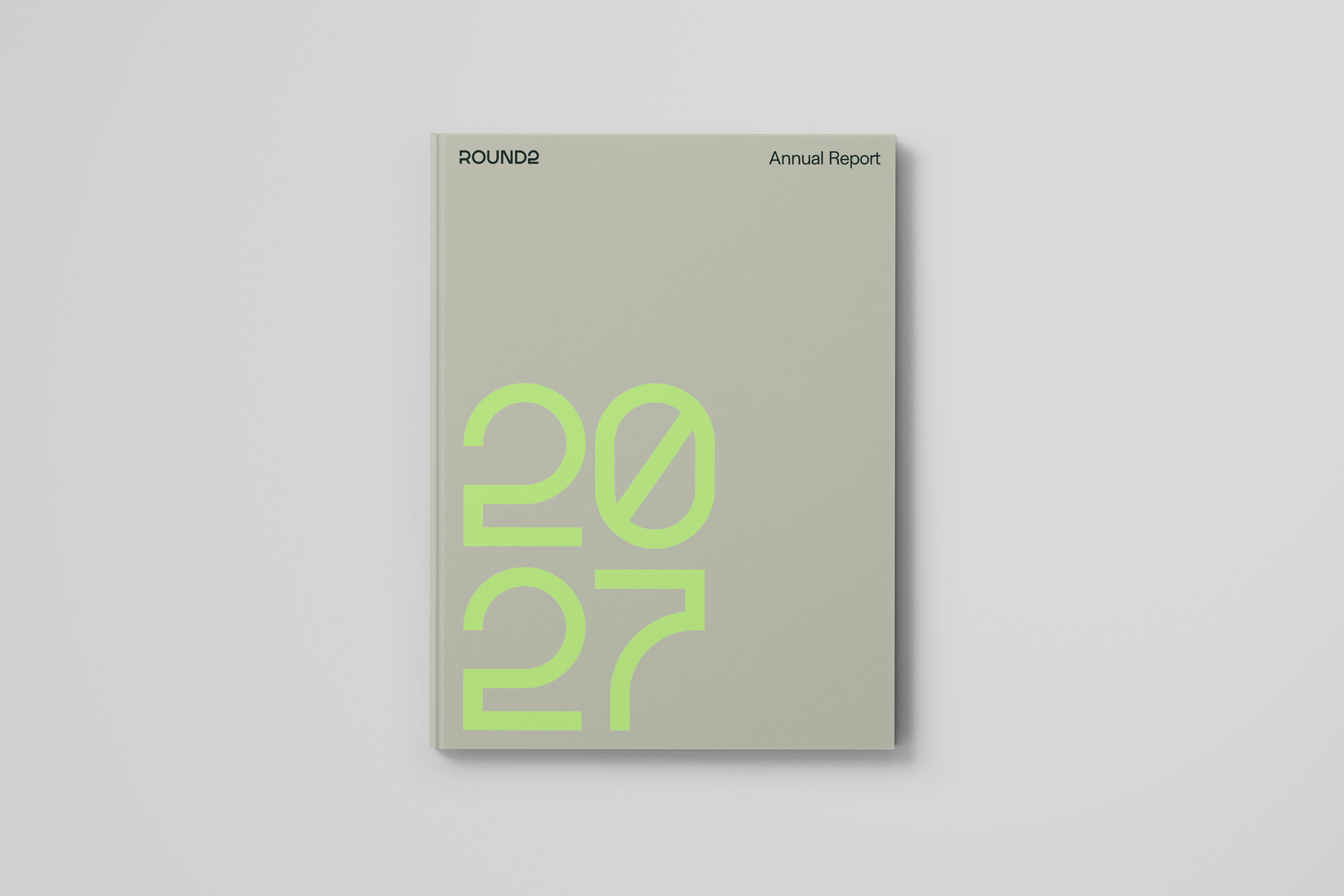
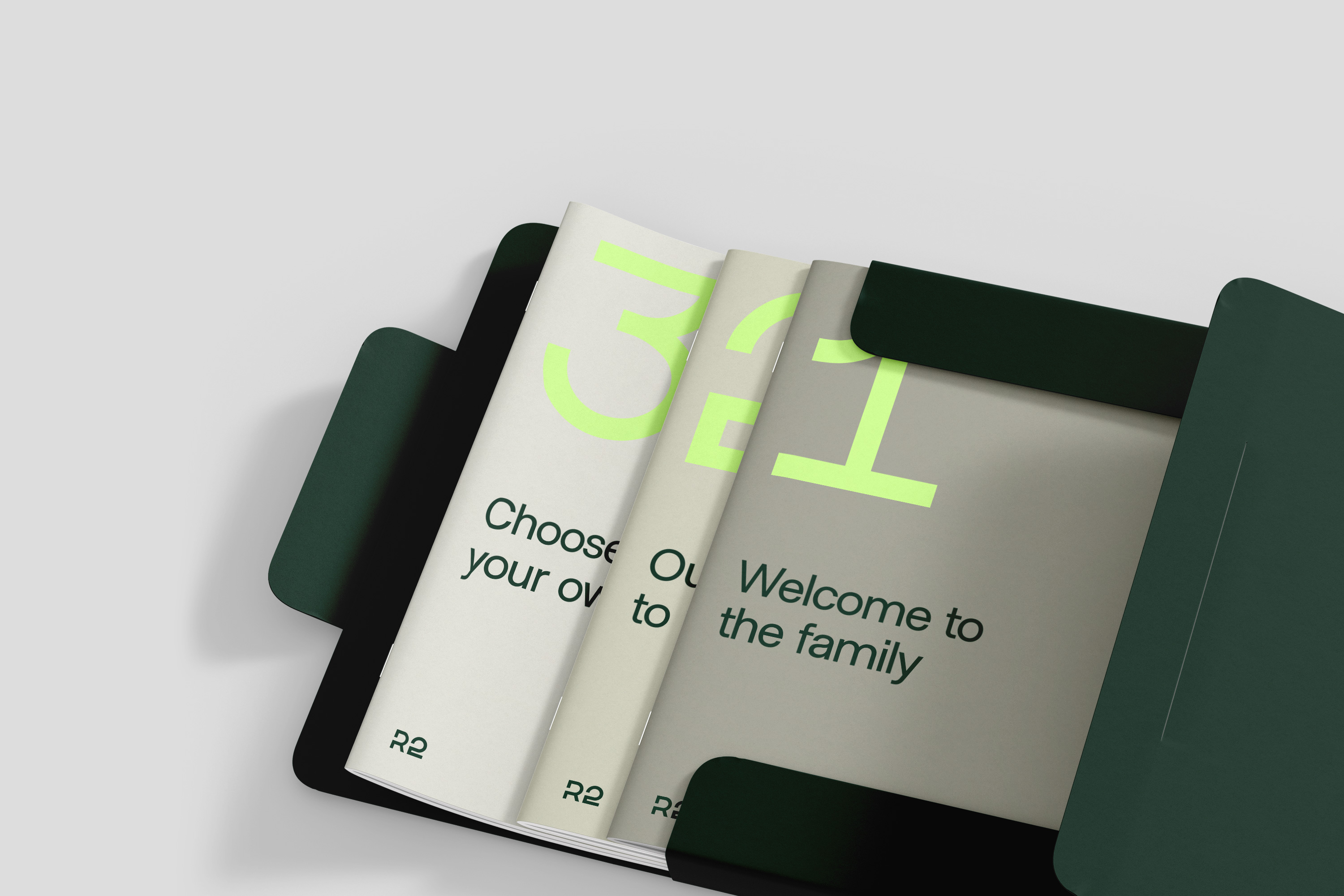
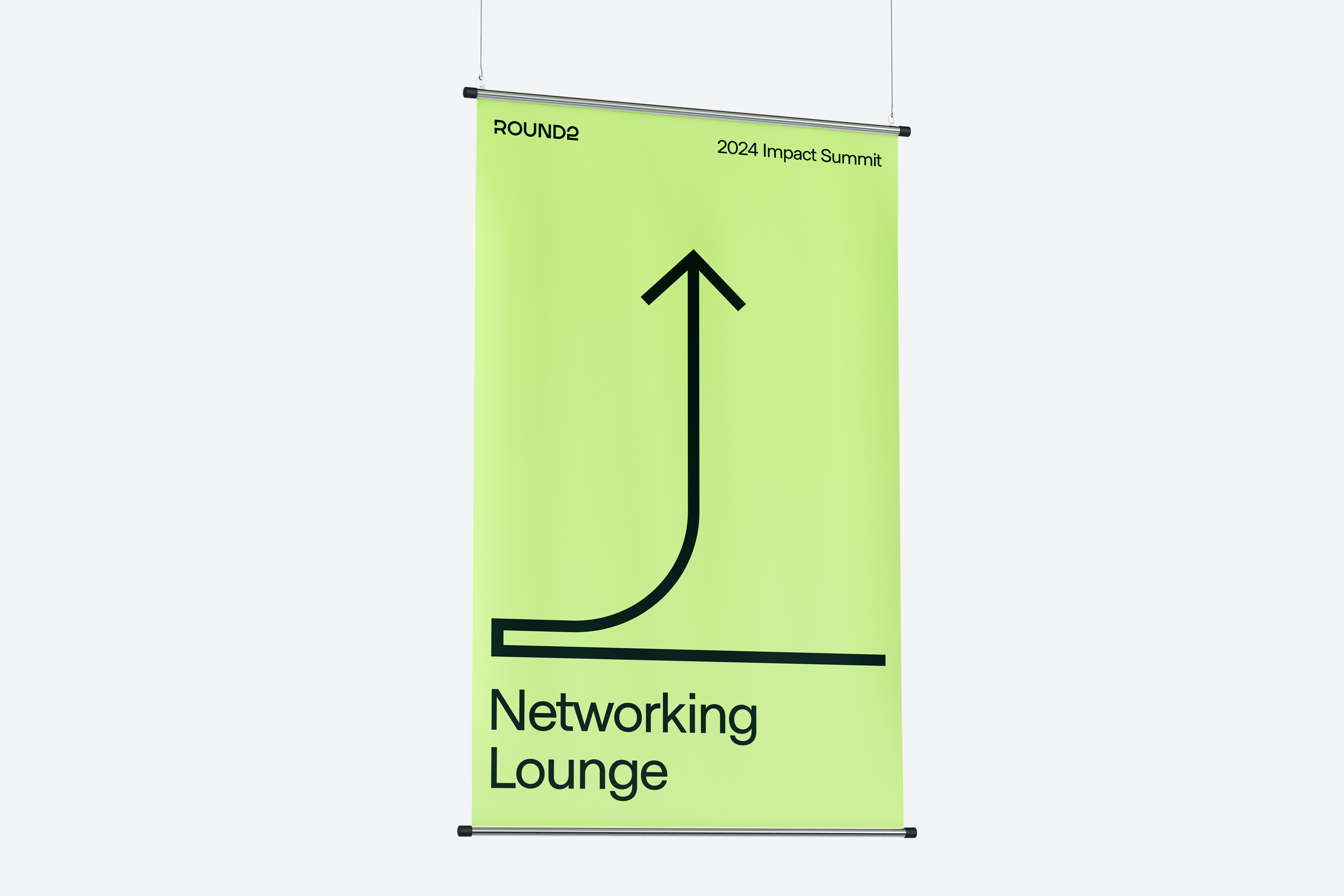
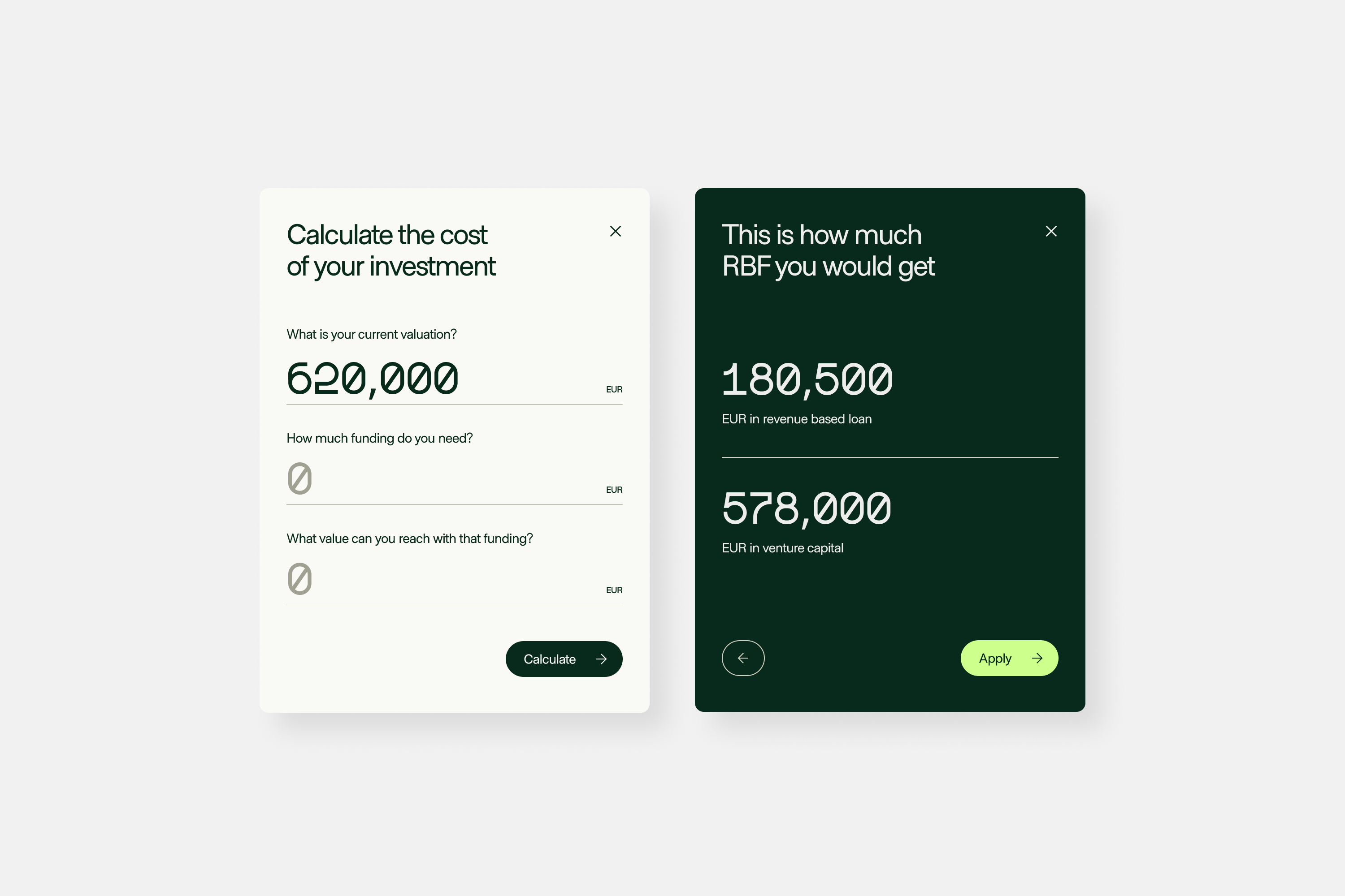
“Progressive and Performance” came to life with an electric green and a custom typeface that transformed numbers into a unique visual language.

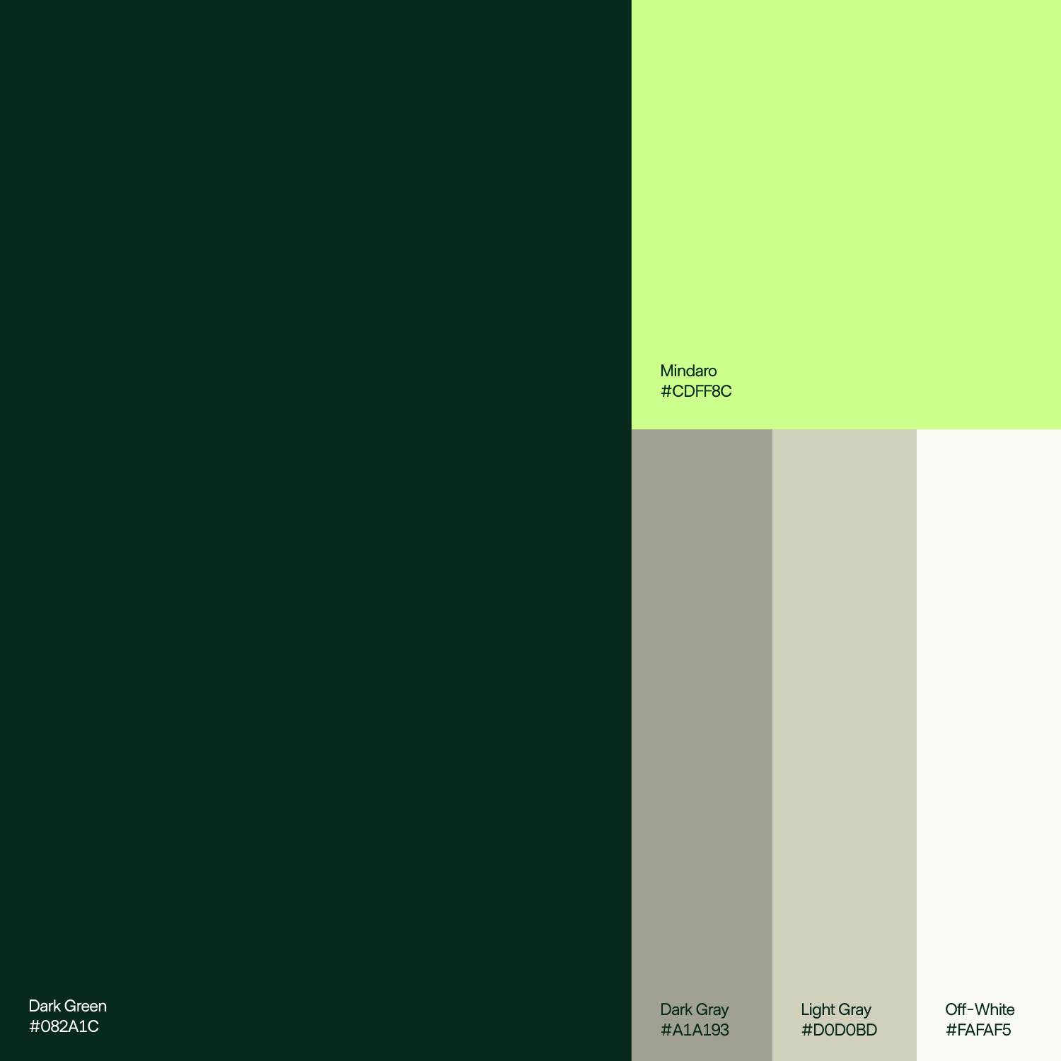
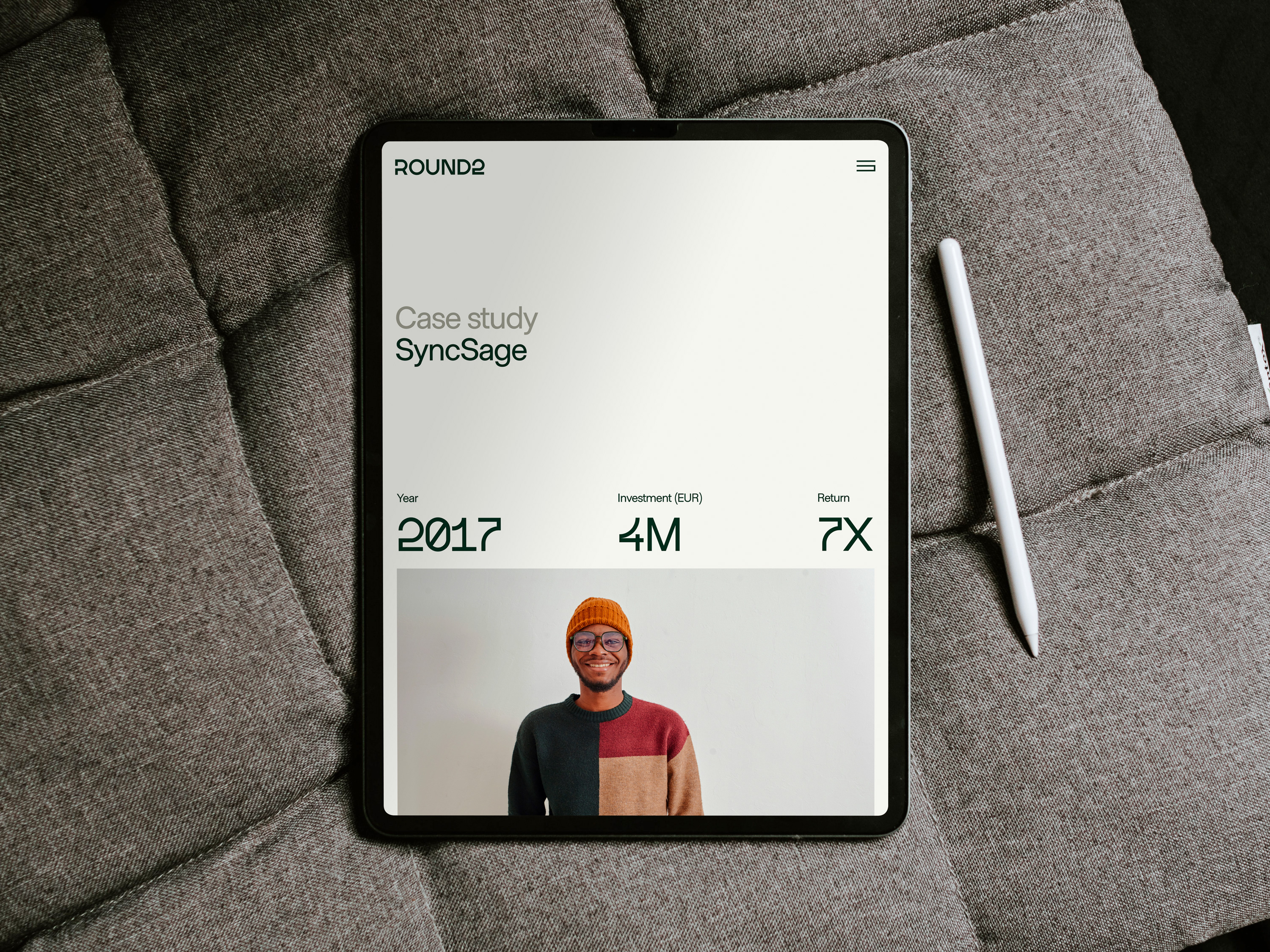
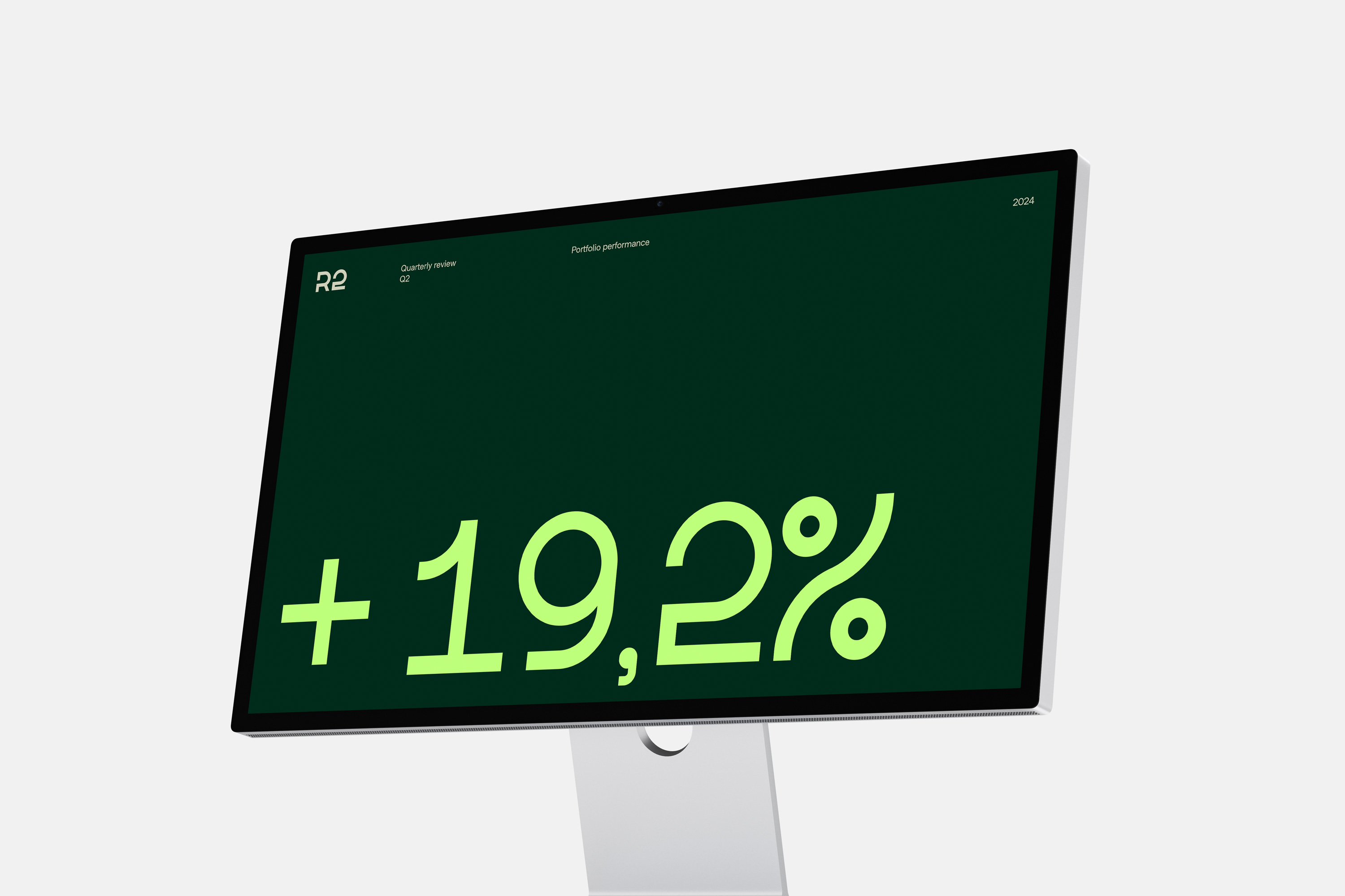
A unique aspect of Round2’s visual identity is the introduction of its custom typeface, R2 Display. Specifically designed to highlight numbers, the typeface plays a crucial role in emphasizing the performance-driven aspect of Round2’s brand communication. This ensures that visuals are not only aesthetically pleasing but also functionally optimized to convey key financial and performance metrics clearly.
Both numerals and illustrations were based on the iconic 2 in the logo, creating a consistent and unique visual language.



“We’re thrilled with the final results,” says Christian Czernich, Round2’s co-founder and CEO.
“The team at G—W clarified how we talk about ourselves as a business, and gave us a brand that reflects who we are.”
